Lissa Anglin • Part of Me Blog

Art, décor, family and photography- it's all part of me!

DIY

a quick d.i.y. sun shade for the backyard

DIY, AnglinAbode, LIFESTYLElissa-anglin20 Comments
IMG_3308.JPG

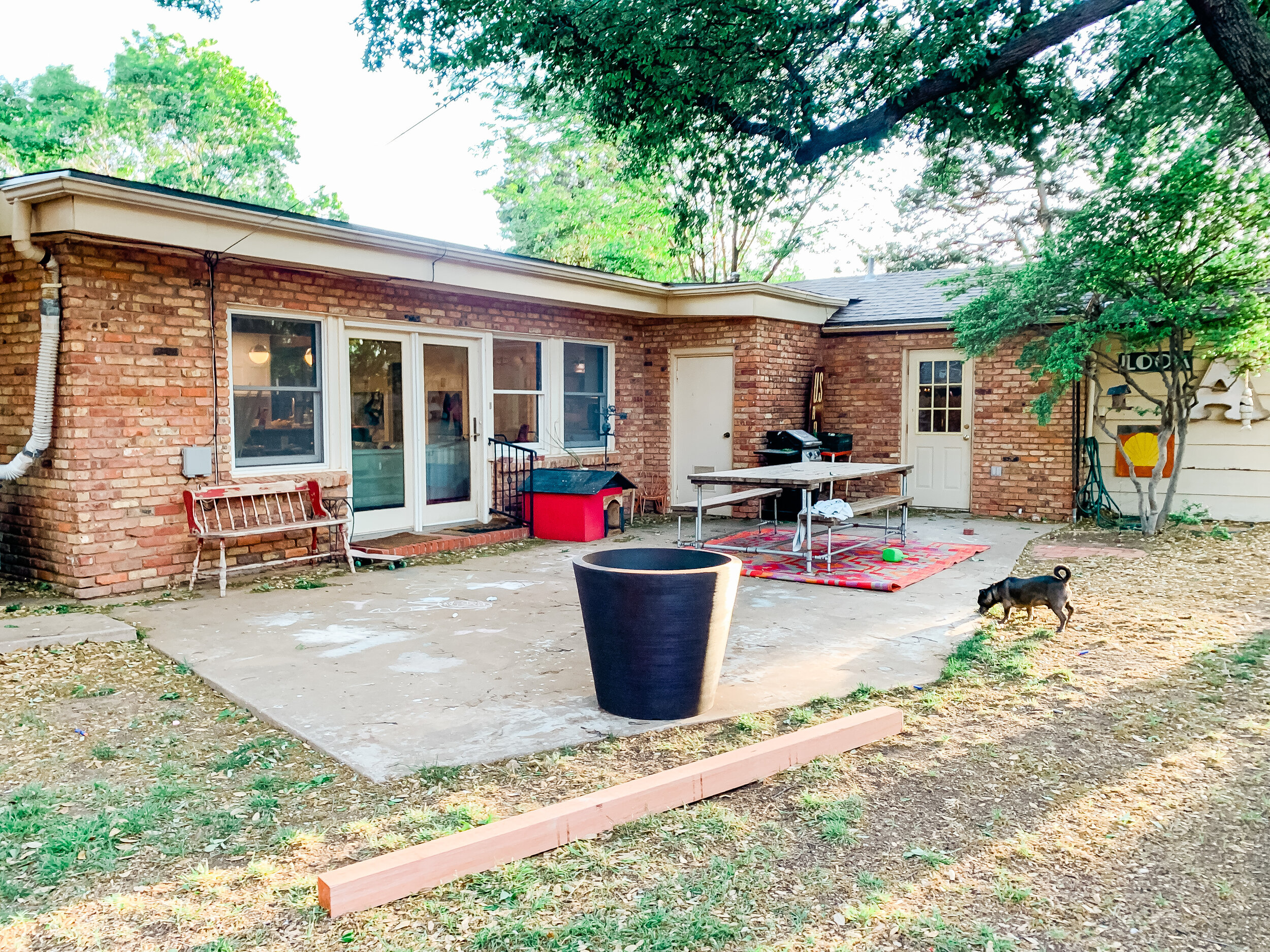
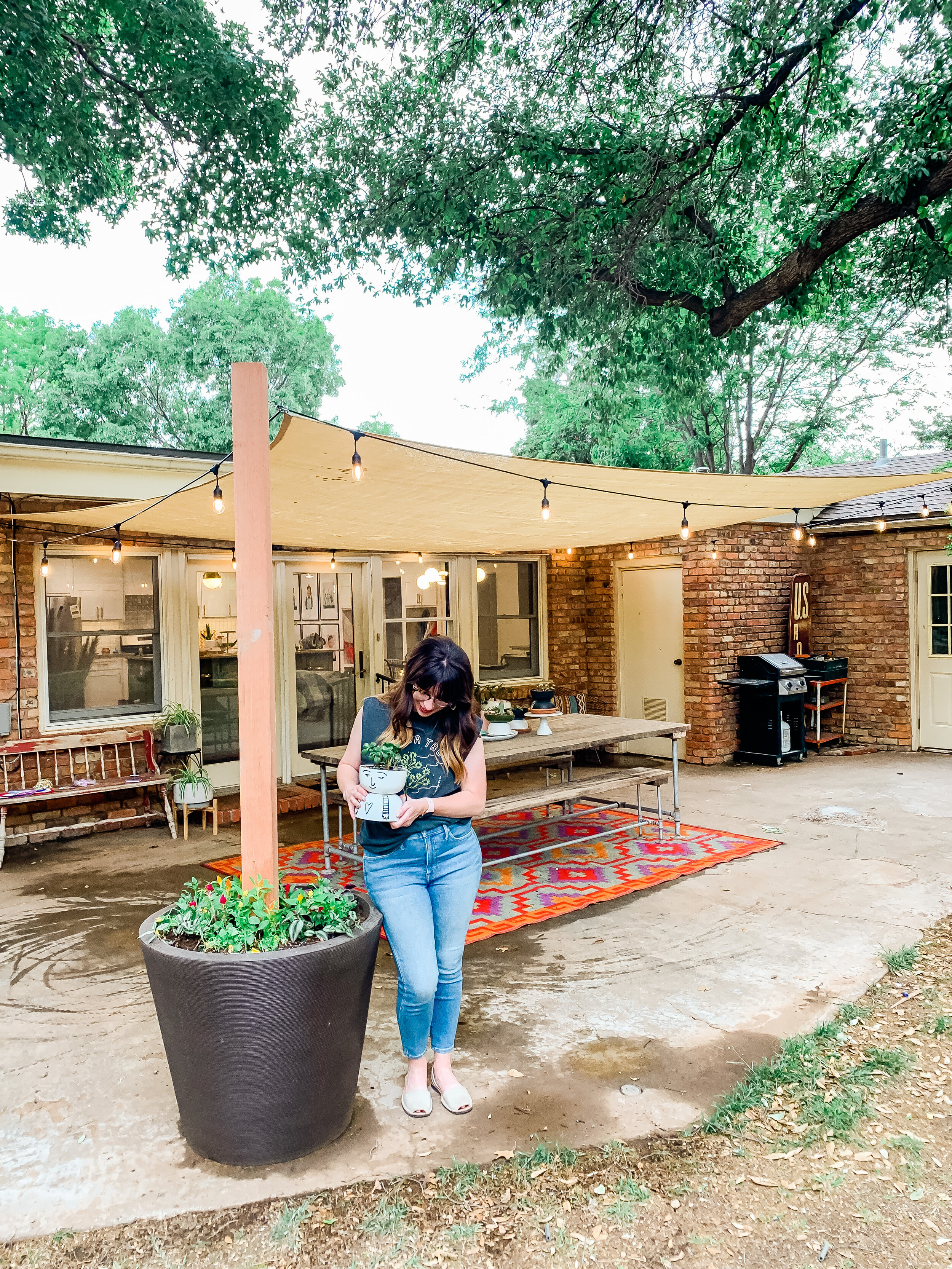
I’m excited to show you this quick and relatively inexpensive project for creating a sun shade patio area. We created our own planter post to act as an anchor point for the sail and it worked beautifully.

We’ve officially been in out new house for a year now and have been excited to work on some outdoor projects now that the weather is warming up. Our backyard patio area has a concrete slab, but that’s pretty much it. We’ve known we wanted to get a pergola eventually, and have even gotten a few quotes for one, but with the cost of lumber sky-high and other renovations taking priority, we opted for a much less expensive quick fix.


IMG_3052.JPG

Materials Needed:

  • Shade Sail- we bought ours on Amazon and got a 14x20 size. There are a ton of sizes and colors available. Tip: be sure you remember that there will need to be some space between the shade sail and your anchor points to properly create tension and keep the shade taut. Otherwise, it will be drapey.

  • Outdoor String Lights- these are the ones we got and we love them! They are plastic bulbs but look like glass.

  • Large (and I mean LARGE) planter- we bought ours at At Home and it is probably 2’ tall and 1.5’ at the base.

  • Quickcrete Concrete- we bought 4 bags

  • 4x4 8’ Cedar Post

  • 4 1/4” Eye Hooks for anchoring the sail to the house/tree/post (hardware store)

  • Coated cable up to 1/8” and cable fasteners- we needed these on a couple of sides where the anchor point was farther away (hardware store)

  • Carabiners to easily connect/take down sail at anchor points (hardware store)

  • Tension hooks to adjust tension on sail- you need at least 2- these we bought on Amazon

After we gathered all our materials, we got started on the planter post. First we centered the 4x4 in the middle of the pot, and while I held it sturdy, Shawn mixed the concrete around it. It didn’t take long at all for the concrete to set. We let it dry overnight.

IMG_3059.JPG

After the concrete was dry, we tested the post with a lot of pushing and tilting to be sure we didn’t need to add another layer of concrete. We ended up throwing in some extra bricks we had just to add some weight and drainage for the flowers I would be planting in the pot.

Then, it was time to start hanging the sun shade. This involved a lot of troubleshooting thought about where the exact anchor points needed to be. We ended up drilling 2 eye hooks into the brick of the home, one into the planter post, and one into a large tree probably 15 feet away from the patio area that was at a better angle than the original tree we’d envisioned using. Shawn set an anchor point about 15’ up in the tree so that the cable actually goes over the roof of our home and won’t interfere with anything.

We used carabiners to attach the sail so that in the case of very strong wind we could quickly take the sail down- and we plan to take it down in the winter as well.

partofmeblog.com.png

Once everything was attached, we used the 2 tension hooks to tighten the shade.

Then, it was time to hang the lights. I’d initially thought I would put them in an x shape underneath the sail, but they hung too low for my liking, so I ended up hanging them in a box shape. Since they are made for outdoor, I wasn’t too worried about weather on them.

It was finally time to pot some plants in the planter. I drilled 6 drainage holes about 1/2 way down the pot and then filled the pot with potting soil and added plants. I am glad we added the bricks because they will soak up excess water as well, while also allowing for drainage.

And that was it! We are loving our new shade sail and I can’t wait to work on some seating/decor for the rest of the patio area!

I wish I’d done a better job taking photos of the process, but it went so quickly I forgot! Here is a semi-put-together recap of my Instagram stories about it for all you visual learners like me!

DIY Scribble Floral Mural

HOME + LIFESTYLE, MOMLIFE, DIY, CRAFTSlissa-anglinComment

This is an idea I've had brewing in my head for well over a year now. It all started when my sister put in this gorgeous wallpaper in her daughter's nursery. THEN I started crushing on this Hygge & West wallpaper and just KNEW I had to put it in the girls' room (I'm actually really excited about the wallpaper resurgence- so many modern and colorful designs!).  

However, after doing all the calculations, I decided that it simply wasn’t in the budget. And, after seeing the oversized florals in Hayden's nursery I thought that might be a little more do-able. I also figured I could paint over it if I hated it! 

So, I decided to give the floral thing a shot. This method I used is really so forgiving- I will describe it in detail as best I can! And it was actually a quick project – the planning took a lot longer than the actual painting.

The first thing I did was sketch the composition on my iPad so I knew so I could get my ideas out "on paper", and play with color palettes. I pulled the composition off of a few bouquet photos I liked and traced certain parts of it to get me started. After that it was a matter of filling in the gaps, and repeating some of those same florals in different spots. I knew wanted to keep in the color scheme I have been prepping for their room anyway- pink, orange, mustard yellow, and black and white. I wanted the flowers to have more of an illustrative feel as opposed to a realistic look, which I knew would be a lot easier for me to achieve. I like to call these my "scribble flowers". 

Thanks to my iPad and Procreate, it's actually really easy to share that process with you here:

The room also has a chair rail on all the walls (when we moved in there was a really uh, interesting frog border sandwiched in-between the molding)-  and I wanted to make sure that everything would look right with the chair rail– so I knew I needed to do something to add interest there to keep the flow throughout the room. So, I also drew up a mock up of how it would look in the room. 

My room mock up with the floral design and border.

My room mock up with the floral design and border.

This woman actually swore she would never paint a room pink...famous last words!

This woman actually swore she would never paint a room pink...famous last words!


Once I had come up with a design I was happy with, it was time to paint!

My mom came over and helped me paint the three different colors on the walls – and this is definitely the hardest part! We ended up having to paint the ceiling after we realized it wasn’t actually white, but a very light blue which wouldn’t complement the new colors. I'm so thankful I had my mom to help me pick out the grey color (really more of a greige than grey) on the bottom- previously it was a really blue grey which made it feel cold and sterile to me. Since I knew we'd be adding warmer colors, it was really important to pick a grey with a warm undertone- otherwise it would have made the original grey look very blue.

IMG_8881.PNG

Pink background color: Valspar Arctic Ice 

White: Valspar Downy

Grey on bottom and in mural: Valspar Requisite Grey

We used Satin sheen with every paint- I have found it is very scrubbable without being too shiny.

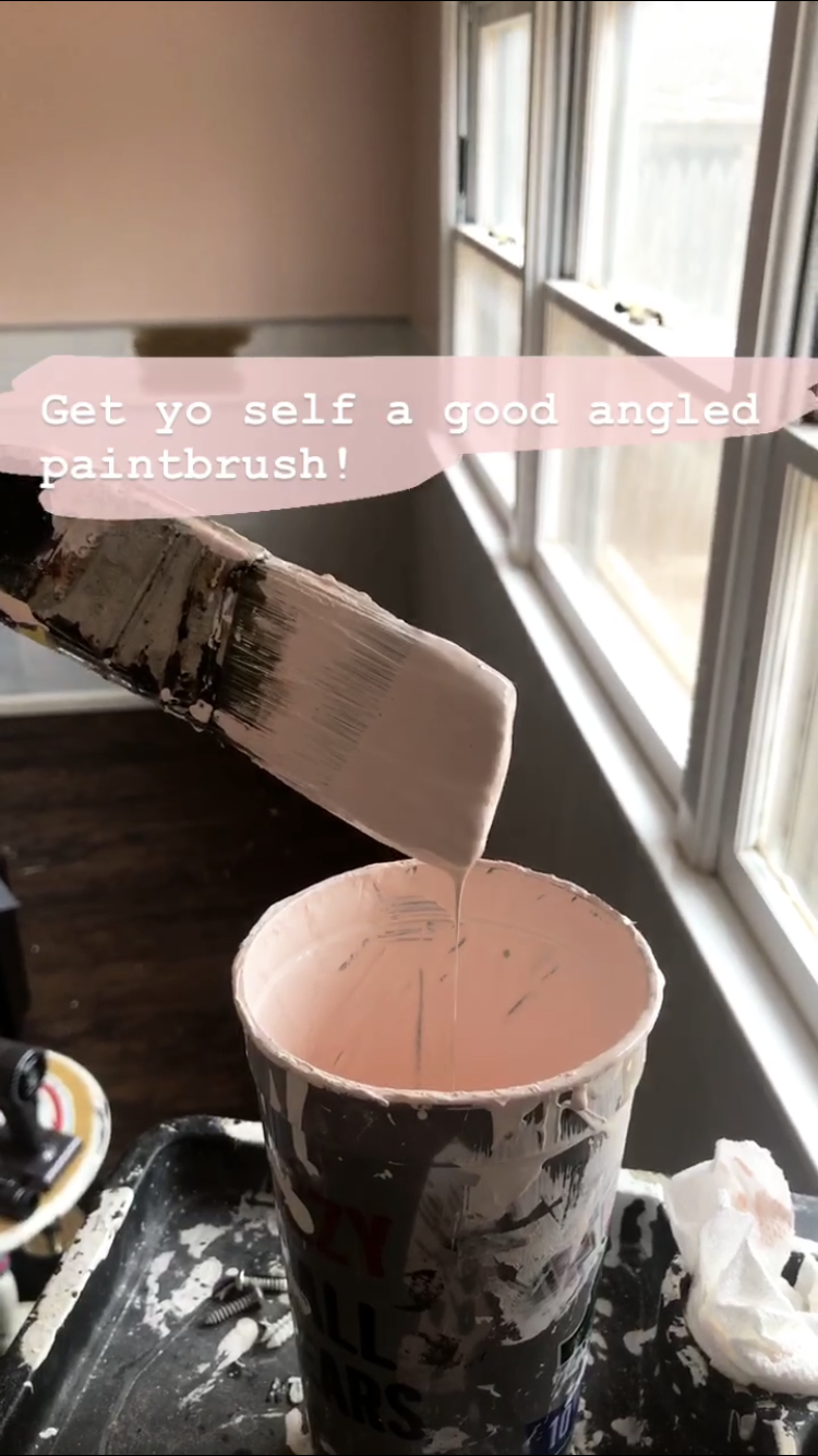
If you watch my Insta stories (follow me @lissaanglin), you’ll remember that I recommended using an angled brush as opposed to a square one. I hate messing with painter's tape and have found that an angled brush gives me as good or better results. The key with the angled brushes to not overloaded with too much paint and go slow.

Once my base coats were ready, it was time to sketch out the composition. I’d like to do my outlines with chalk, since it wipes off easily. At first I tried drawing with white chalk, but it just wasn’t enough of a contrast on the pink, so I ended up using a light purple chalk. It did end up mixing with the paint somewhat, but it just wasn’t that big of a deal for me – so be warned if you choose to use a darker color of chalk – you might see it a bit!

Next I mixed all of my additional colors for the mural. To keep everything really consistent, I chose to use the same white paint that was on our trim and chair rail, so that all of the paint would have the same base color. Not all white paints are created equal – some have a blue base, some have a green base, some red, some yellow – you get the idea. I mixed the paint in my fancy Solo cups- adding about half a cup of white paint and then tinting the white with these paints from Michaels by adding just a bit at of color at a time and stirring well.

I am a messy painter!

I am a messy painter!

Keep in mind that your paint will dry darker than it looks when wet. It might be a good idea to paint yourself a test on a piece of paper and let it dry so that you can see the actual colors. I would also suggest using a more limited color palette – three or four colors max – it will keep it much more consistent and professional looking.

Once I had the composition sketched out and paints ready, it was time for the paint bottom layer which I'm calling the "blobs". This is a really fun part of the process. Using a square brush like these, I began to apply my blobs of paint using my outlines guides- but I wasn't too precious about it. ;)

 I wanted to make the color bleed outside of the outline in the end, so I purposely made the color blobs a bit larger than they needed to be. For simplicity sake, I decided to make all of the same types of flowers the same color – so peonies were pink, chrysanthemums were orange, etc. I attempted to do a time-lapse video of myself painting, but didn't quite make it to the outlining stage before my iPad died. However, hopefully this video will give a good idea of how I painted my blobs:


Once the blobs were finished, I let the paint dry fully and then it was time for the outline! I recommend using a round brush (these are great) for the outlines. Keep in mind you will likely need a smaller brush than you think, because when you put pressure on the brush, it’s going to get bigger. So, it’s better to lean on the smaller side so that your outlines don’t become too big.

Can't wait till there are two sweet girls playing in this room!

Can't wait till there are two sweet girls playing in this room!

Looking at my original sketch, I began to paint the outlines over my colored paint blobs. I didn’t worry too much about staying inside or outside of the lines – and purposely went outside the lines frequently. I used only 1 round brush for all of the outline, so that it was consistent throughout.

Once I was finished, I added some random colored dots/blobs of all the colors I used around the entire piece.

That’s it! I needed up having quite a bit of extra paint that I had mixed, and I didn’t want to throw it out because I’m a paint hoarder, so I went to the dollar store and bought some cheap plastic containers that worked perfectly for storage. Now if anything ever happens to the flowers (likely in our household), I have handy touch up paint.

After I was done I was hesitant to hang the curtains on top of the flowers, but that had been my intention from the beginning, and I love the way the flowers peek out from behind. Also, this room has a ways to go but let's be real- the toys are usua…

After I was done I was hesitant to hang the curtains on top of the flowers, but that had been my intention from the beginning, and I love the way the flowers peek out from behind. Also, this room has a ways to go but let's be real- the toys are usually on the floor anyway. :)

There you have it! If you made it through this far, thanks for reading and I hope you attempt some scribble florals yourself!

Always a project...Knox's Room Update

HOME + LIFESTYLElissa-anglinComment

I just can't ever sit still with house projects. Once I complete one, I have the urge to start something new, and much to Shawn's chagrin, that usually involves paint. :)

This project, however, my husband has actually volunteered himself for- so in order to keep my worker happy, I am doing the most planning ahead that I can.

What's the project, you ask?

Oh, just the one where we switch out the kids' bedrooms in the middle of our busiest work season.

Our house has 3 bedrooms, two of which are the EXACT same size, and located on the same side of the house- one nearer the front of the house, and one near the back. When we moved into this house, we only had 1 kiddo (Knox) and so we put him in the bedroom that was toward the back of the house, which worked perfectly- until we had another baby. 

Liv's nursery/room has inhabited the front bedroom, and there have been many times I wished I had switched their rooms. Namely, those times the doorbell rang and woke up the sleeping baby I had in the room right next to the front door. 

So, realizing that we will be welcoming another sweet girl sometime in the near future who will share a room with Liv has made me want to go ahead and do the switcheroo. So maybe you could call this nesting, in a way?

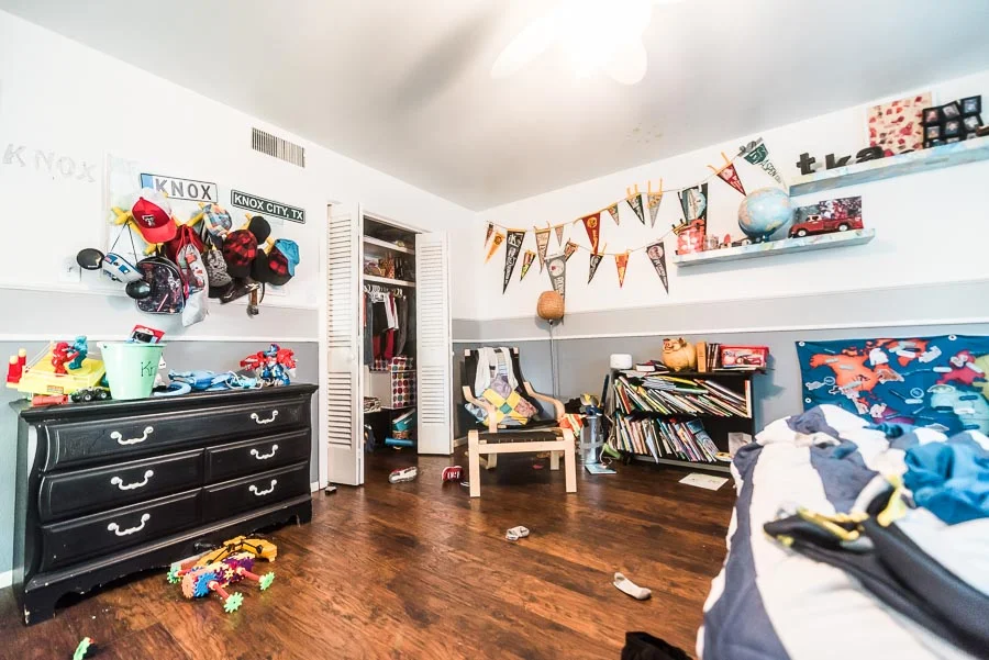
Regardless- it's time for Knox to get a little update. Here's a current view of his room:

KnoxRoom-7488.jpg


Yeah, that's right- this is the way it USUALLY LOOKS. No prettying up real life for the internets here. 

I've made peace with the random socks and shoes on the floor, and we just aren't the people who make their beds every morning. But the books on the ground, the toys piled up on every piece of furniture, the sheer amount of toys that aren't actually played with anymore...those are the things that drive me bonkers. 


Here's what's working/what I'd like to keep for this room:

  • The full size bed
  • The vintage pennants and signs
  • The little mid-century bookshelf (I salvaged out of the alley many years ago)
  • The Ikea Poang chair and ottoman
  • The dog tail hooks that are holding up the art (not pictured)
  • The square storage shelves (functional, though I may want to update the fabric boxes)
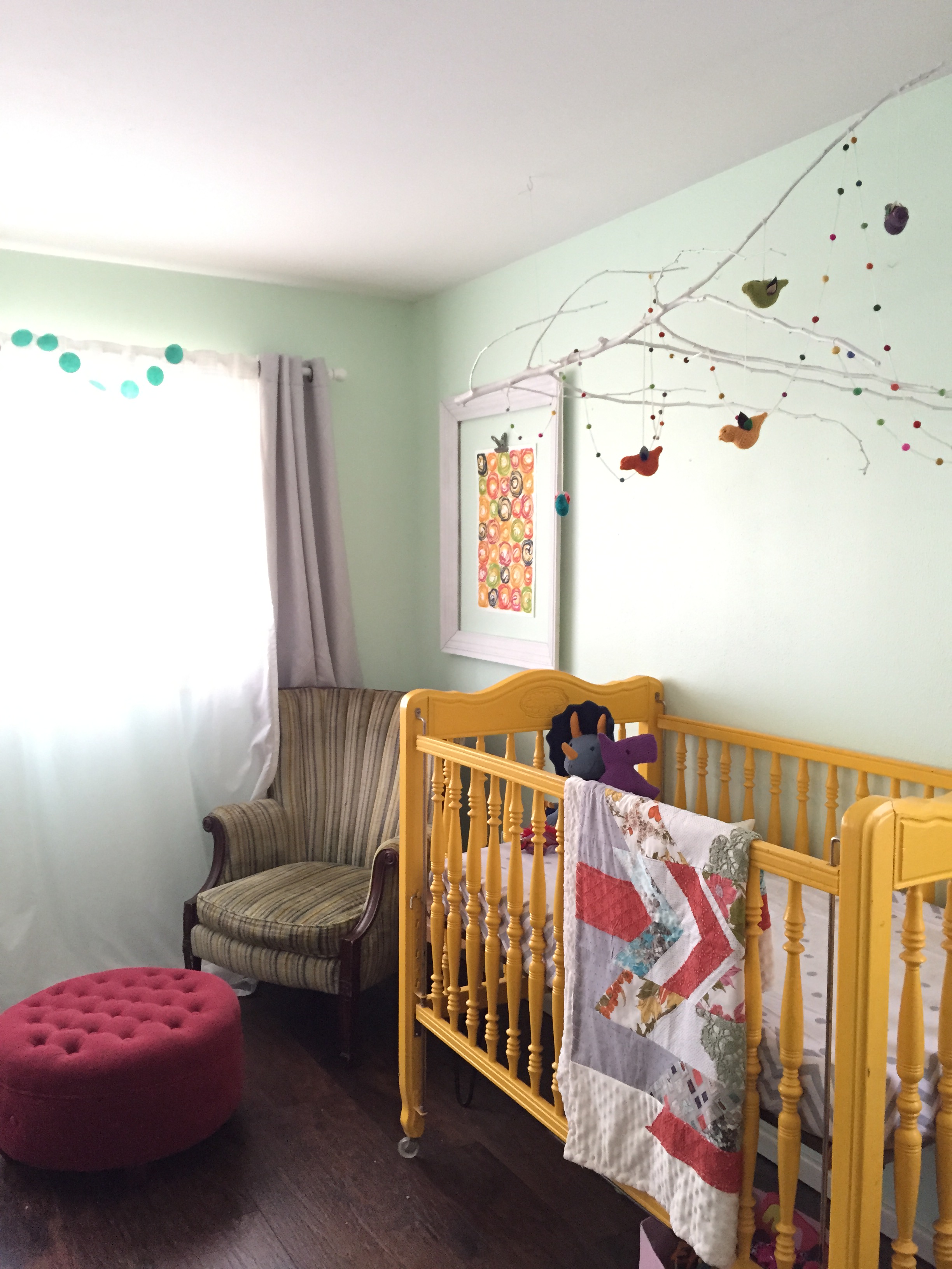
Current mint wall color.

Current mint wall color.

Here's what I want to see gone/improved:

  • Hanging chair
  • Dresser (possibly)
  • Train table
  • Floating Shelves
  • Toys no longer played with (which is going to be a job in itself)

Another thing I am considering is that he will need to be able to "grow with" this room. He is just 6 right now, but I'm wanting to make it more of a "big boy" room he can really utilize in the coming years.

So, I'm wanting to add:

  • Desk
  • Upright storage or mirror over dresser
  • Nightstand

Liv's room (a.k.a. Knox's future room) is currently painted a happy, light mint color- and to save myself some time, I am hoping to keep that color, while adding an accent wall. 


Check out the mood board I put together:

I'm hoping to reuse several items we already have, plus add some must-haves for a "big boy" room, like a desk, reading light, and extra storage in an armoire. 

One of the things I am most excited about is creating an engineering print mural on one of the walls. This will be my third experience doing a mural like this- my first was in our retail store, Culture Clothing- look how tiny Knox was when I was putting it up! 

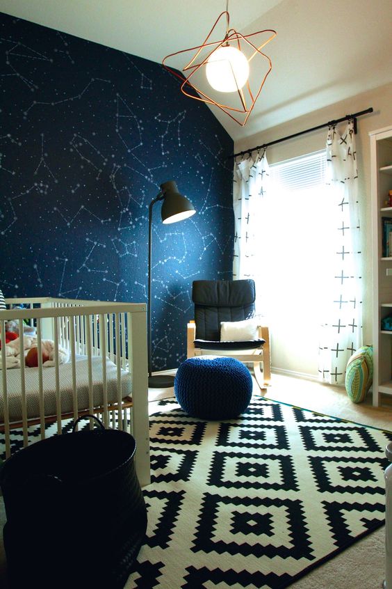
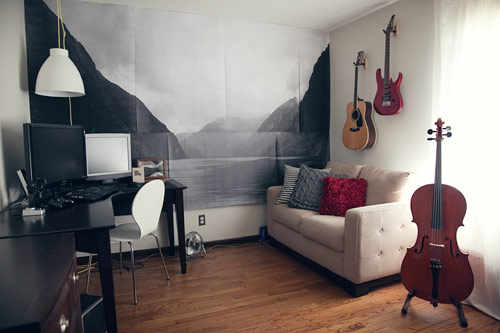
I'm having trouble deciding on whether I want to do an A) Constellation pattern or B) Mountain scene. Knox says he doesn't care and that he likes both. So, what do you guys think? Here are a couple of photos for inspo:

Source

Source

Source

Source

No matter what, it will be black and white print, though I do love the blue of the constellation wall- it's just much less expensive to do the black and white!

I'm also debating about curtains- hoping to keep them some sort of black and white pattern, but- how important is it that I get blackout curtains now that he is 6? Also, we will be raising those curtains allllll the way to the ceiling this time.

I also have not even thought about bedding yet- eesh! He does have a white down comforter inside the duvet he is currently using- so we will probably just stick with that. Simple. And BLEACHABLE. 

Any other input/thoughts/ideas/wish-you-hads for me?