Lissa Anglin • Part of Me Blog

Art, décor, family and photography- it's all part of me!

home decor

Terracotta Floor Vase DIY (on the cheap!)

CRAFTS, DIY, AnglinAbodelissa-anglinComment

Well friends, we have officially finished the renovation process of our home- I really had great intentions to share more of the in-between process, but now I think it’s best I go room-by-room so that I can show you the full transformation in each space.

That being said, as I work on getting everything styled/decorated, I have been working on some fun little side projects, like this one!

terracottafloorvase.png

If you’ve been on the internet for half a second lately, you will have seen the HUGE pampas grass trend that’s happening right now (here you go just in case you don’t believe me)- which is super handy for those of us living in West Texas, because it grows really well here. In fact, my parents happen to have some in their backyard.

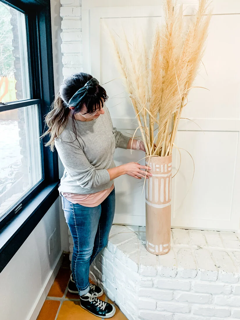
So, I asked my mom to bring me some to use on our fireplace mantel. Little did I know that they would literally be 5 feet tall and waaaayyyyy too big to put in the tiny vase on our mantel I’d planned. So I decided to just put them in a floor vase on the ground. Problem was- I had no floor vase, and barely any budget to go out and buy one.

That’s when I found myself hanging out in the air ventilation section of Lowe’s looking like a crazy person to the many contractors who came and went while I pondered. But guess what, ya’ll? I DID IT. I made a vase, and it only cost me $15.

This project was definitely more of an experiment than an actual “project”. I had seen the terracotta paint trend on Tiktok and thought this would be a fun opportunity to try it out. Warning: THIS IS A MESSY, IMPERFECT PROJECT. If you are a perfectionist, maybe just save up your dollars and buy yourself a vase. But if not, read below to see how it turned out!

Here’s a quick little video if you want a sneak peek of the process:


What you’ll need:

  • Galvanized Steel Round Duct Pipe found in the HVAC section at the home improvement store

    • I used a 6”x24” one ($7), but you could use any size- they have larger ones

  • Galvanized Steel Round End Cap (also in the HVAC section)

    • You will want to be sure you get the same width as your pipe- in this case 6” wide

    • This cost around $6

  • Plaster of Paris (found in the paint section, but I already had some at home)

  • Medium to coarse grit sandpaper- I used 60 grit I had at home

  • Vinegar

  • Water

  • Duct Tape

  • Wide Paintbrush

  • Acrylic paint (I used brown, red, black and yellow to create a terracotta color)

  • Polycrylic Satin Finish (not necessary but recommended)

IMG_8918.jpg

Step 1: Build the vase

This is pretty self-explanatory: the pipe has a snap-lock design that literally just pops into place. Might want to wear some work gloves while doing this, though- those edges can be sharp!

Once the tube is made, insert the end cap. It should fit perfectly on the plain end of the tube (not the side with the waves).

Step 2: Prep for paint

I used the duct tape to cover the top end of the vase- so that it had a rounder edge and I wouldn’t be cutting myself while working with it. I used several pieces and just folded it hot dog style over the lip.

Next, you’ll want to wipe the outer surface with vinegar. Just wipe and let it set. And then sand your little heart out. The galvanized steel has a chemical layer on it that keeps it from rusting, and that needs to come off in order for the paint to adhere. The vinegar helps it break down, and the sandpaper takes it off.

Sand everything for as long as you can. The rougher the surface, the better your paint will adhere- and even sand the duct tape a little. It will be fine, I promise.

Step 3: Paint

So there are many different recipes for terracotta-style paint- but I chose to use Plaster of Paris because 1. I already had some at the house and 2. I like working with it. It’s water soluble and pretty forgiving.

To mix your paint, you’ll dump a cup or so of the plaster of paris into a bowl, add your paint (I did generous squirts of brown, a little red, and a little yellow), and then around a 1/2 c of water. Use a popsicle stick (or some other hard tool) to mix. You want your mixture to be spreadable, but hold it’s shape- I would say a thick milkshake texture. If it’s too thick, add a bit of water. If it’s too thin, add a bit of plaster.

For more of a visual on mixing the paint, check out my short video above.

1st coat finished and dry! As you can see, the plaster mixture is much darker when wet.

1st coat finished and dry! As you can see, the plaster mixture is much darker when wet.

Also remember that because the plaster is white it will naturally make your mixture lighter. It will also dry significantly lighter than it is when wet. I did a few test colors on the protective cardboard I was working on to check color before I actually started painting the vase. To do this, just wipe a bit of the paint/plaster mixture on a surface and use a blow dryer to dry it. It should lighten considerably and give you a realistic color representation.

You will need to work relatively quickly, because your plaster will harden and create chunks in your mixture. If you’re into the texture, go with it. If you’re not— don’t say I didn’t warn you. :)

Turn the vase upside down and start painting. Your first layer will be thin and you’ll likely be able to see the metal through it in places. Be sure the bottom is completely dry before flipping it over to paint the top lip. I also painted the top 3-4 inches of the inside. The plaster is very fragile as it dries and so it will chip off if you’re not super careful when you’re moving the vase around.

Here you can see the texture of the plaster and the inside of the vase with only 1 coat.

Here you can see the texture of the plaster and the inside of the vase with only 1 coat.

Once you have 1 coat, cover your plaster mixture (if you don’t, it will dry and chunks will form!) until you are ready for the 2nd coat.

Repeat the process with 2 more coats. The texture should build considerably, and the pattern/seams in the metal should disappear under the plaster. If you feel the vase is getting too texture-y, don’t worry- once it’s dry, you can lightly sand it with sandpaper and it will smooth out.

I paid special attention to the tip rim of the vase once I was finishing up- making sure there was enough thickness there with the plaster.

Step 4: Paint Details (Optional)

Once the plaster was completely dry, I decided to add some detail to make it look more pottery-ish. To be honest, I’m still not sure if I like it, but I’m going to let it hang out by my fireplace for a while to see if it grows on me.

To paint the detail, I just thinned out some white acrylic paint and used a round brush. I wanted the detail to be a little transparent, and this did the trick. If your paint is too thin and it drips, it’s pretty easy to wipe off with a damp paper towel.

The finished product!

The finished product!

Step 5: Topcoat

This step could also be optional if you are super in love with the matte look and don’t want to change it in any way. However, I will say that the Polycrylic Satin is quite matte when dry and will actually make the vase more sturdy and strengthen the plaster/paint mix- so I highly suggest it.


If you give this project a shot, be sure to share your results with me by tagging me @lissaanglin on social! I’d love to see if I could find some type of cardboard tube to also try with this plaster-paint treatment.

Come say hi on Instagram!

my best staging tips when selling your home

HOME, LIFESTYLElissa-anglin1 Comment
DSC_1104.jpg

If you’ve been following along on Instagram, you know we are moving houses! We have loved our current home for 6 years, and a lot has changed since we moved in- like adding 2 more people to our family and somehow accumulating a LOT more stuff.

We aren’t leaving Lubbock, just moving neighborhoods. Many weeks ago, our Realtor and friend, Jim Archer (who we highly recommend!) knew our desire to find an older home to fix up, and called us about a home he’d found in one of our favorite Lubbock neighborhoods. So, we went to see it, and hated it. But then- plot twist- we ended up buying it! I can’t wait to share more about that, but this post is dedicated to STAGING.

Once we knew we were buying the new house for sure, the scramble to stage our current home began.

Here’s what we did to prep our home to be put on the market:

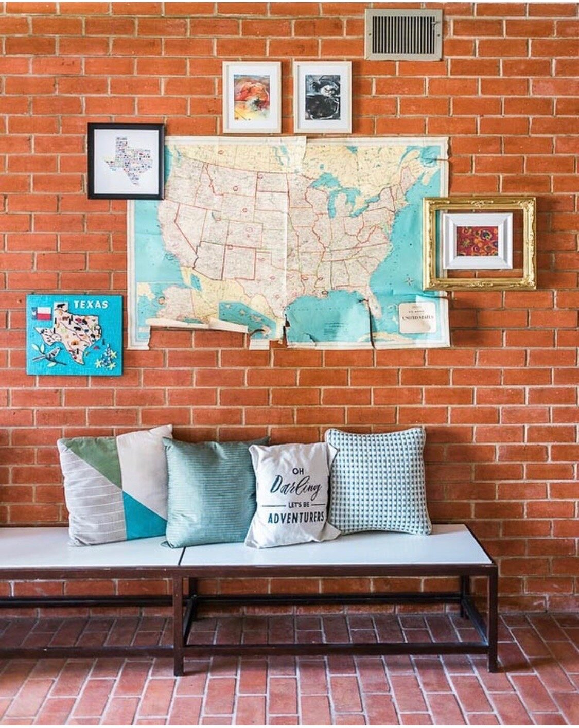
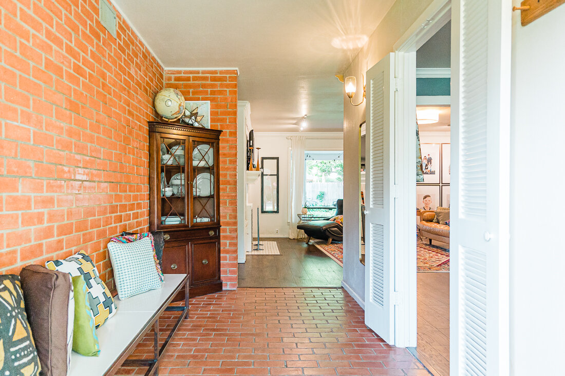
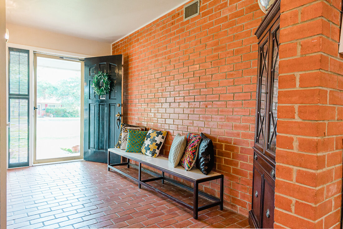
We ended up taking down the map and frames here so that the brick was the focus of our entryway.

We ended up taking down the map and frames here so that the brick was the focus of our entryway.

1. We MAJORLY de-cluttered. I went through every junk drawer, closet, craft room, etc. Marie Kondo style. I kept a trash bag and a box for garage sale items nearby, and tried to conquer one or two spaces a day. Garage sale items went into the garage, and trash went to the bin.

Much of what we removed were kids’ toys. I knew we’d never be able to keep our house clean with lots of toys available to our kids (haha), so we put pretty much everything (including the girls’ large dollhouse) in a storage unit.

We also removed quite a few pieces of furniture in order to open up our main living area and make it more walkable for people viewing it during a showing. Furniture also went into storage.

Another area we almost forgot about was the backyard. All the kid stuff (except the trampoline) was removed. I swear, we found about 47 Barbie shoes hidden in the plants. 😂

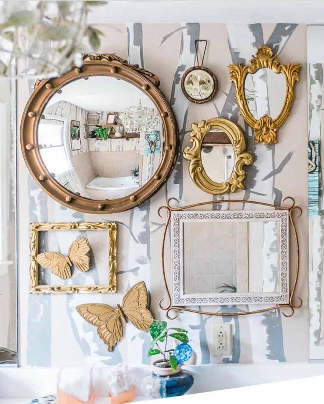
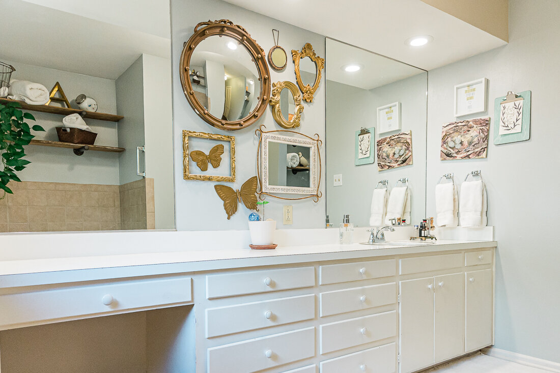
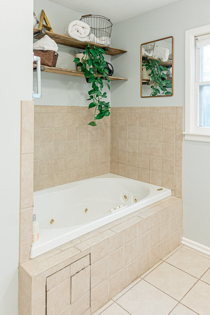
You can see the trees in our master bathroom in this old photo. I pondered removing the mirrors as well, but ended up leaving them for staging.

You can see the trees in our master bathroom in this old photo. I pondered removing the mirrors as well, but ended up leaving them for staging.

2. We took down/painted over super-specific design choices. This was a little heartbreaking to me, as I had spent many hours designing Knox’s constellation bedroom. His room had a large, dark mural on one wall that just had to go- it was much too specific of a design to appeal to a large group of buyers, AND I didn’t want to deter anyone that wasn’t willing to take it down themselves. Thankfully, my mom came over and lovingly helped me scrape all day to get the wallpaper off- not a fun job for sure.

I also had a tree design painted in our master bathroom, which I loved, but wasn’t sure many others would. I chose a neutral grey and it made the space really calm and open feeling. We did leave the girls’ floral bedroom mural in hopes that whomever bought the home might have a little girl, or just like it and want to keep it.

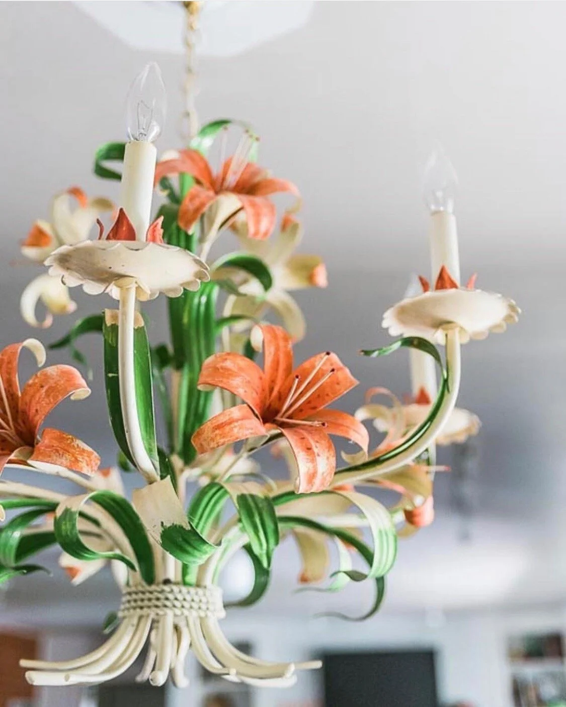
My favorite 60’s toile chandelier has been in our home since I stole it from my parent’s house, haha.

My favorite 60’s toile chandelier has been in our home since I stole it from my parent’s house, haha.

3. We removed fixtures we wanted to keep. We replaced a few light fixtures (like my favorite tole chandelier) with simple neutral ones that would appeal to most buyers.

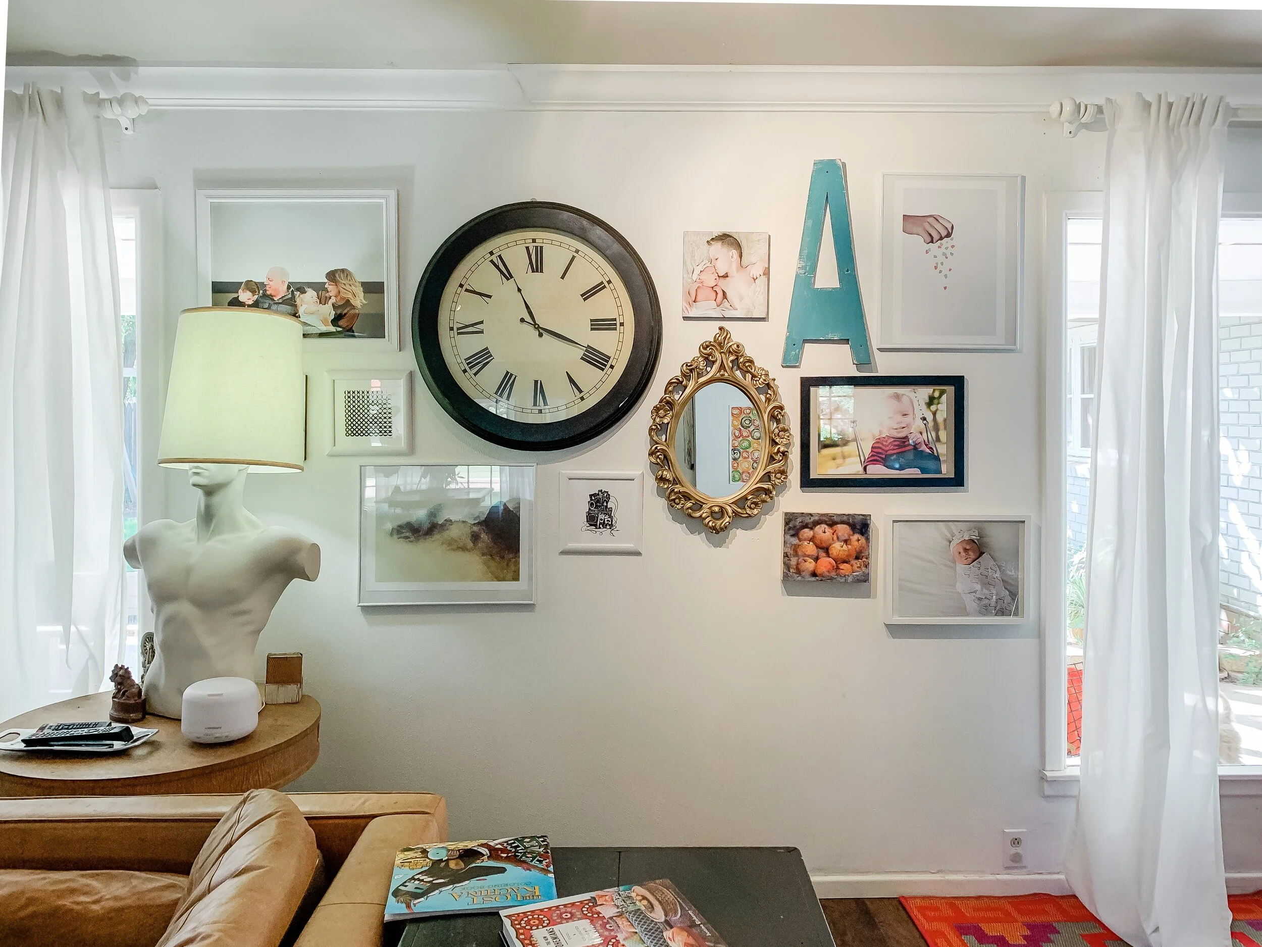
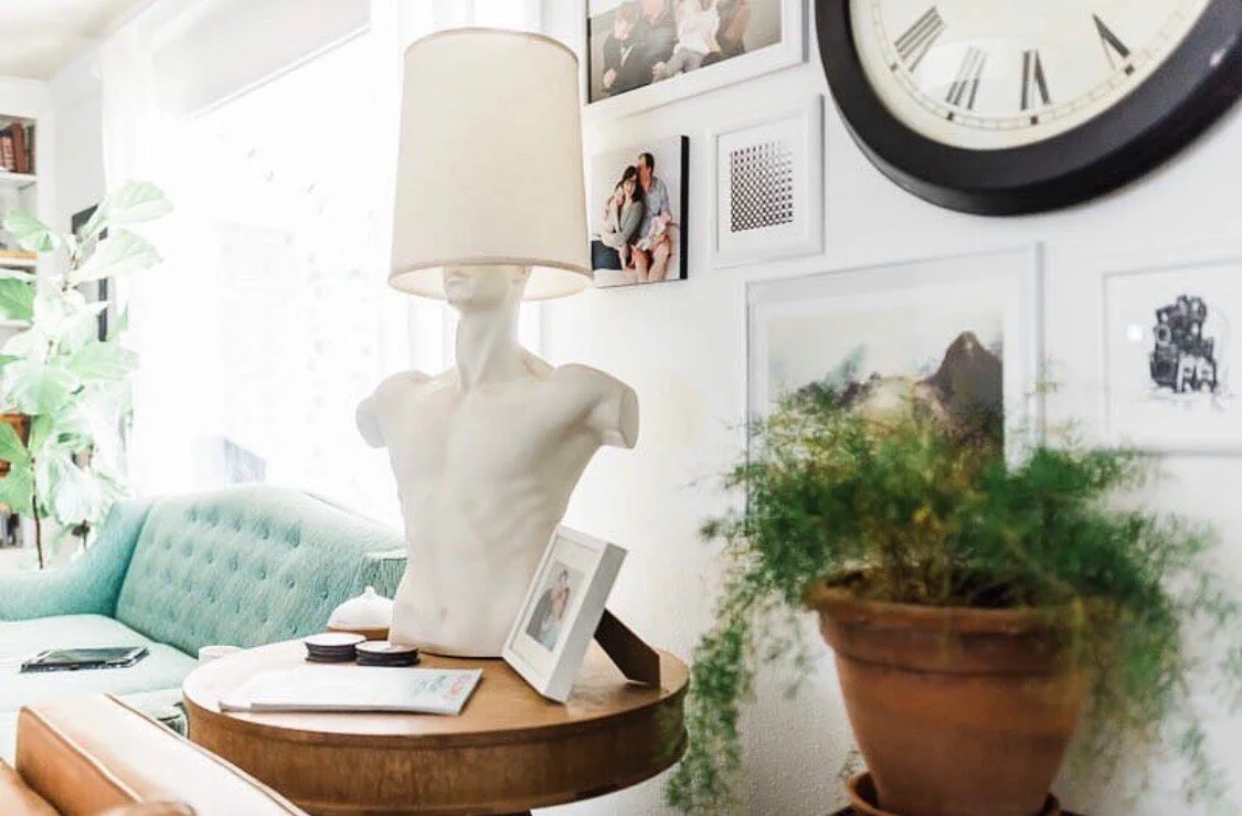
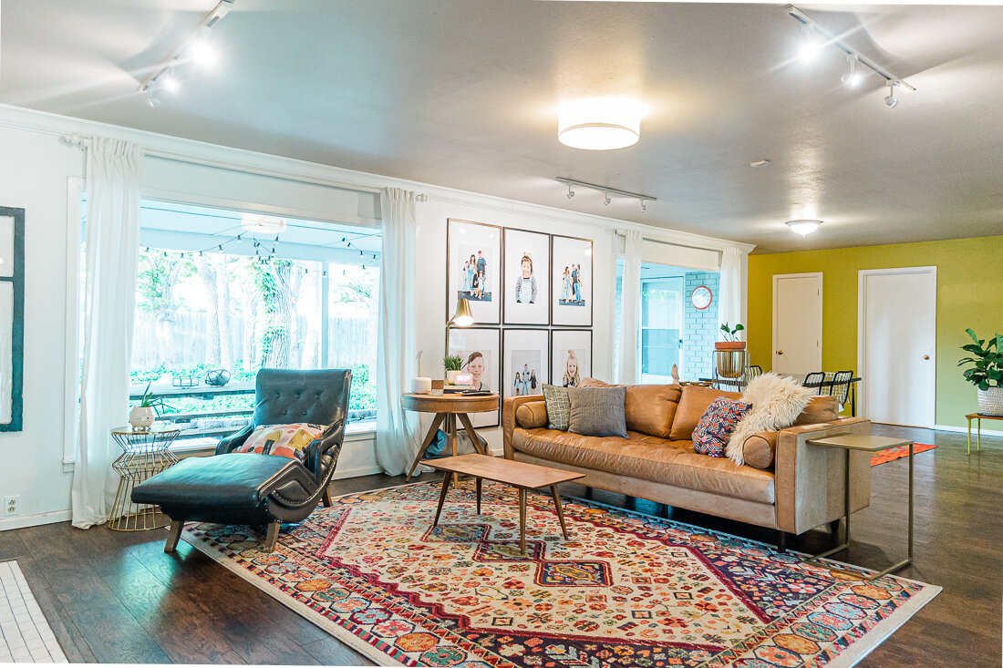
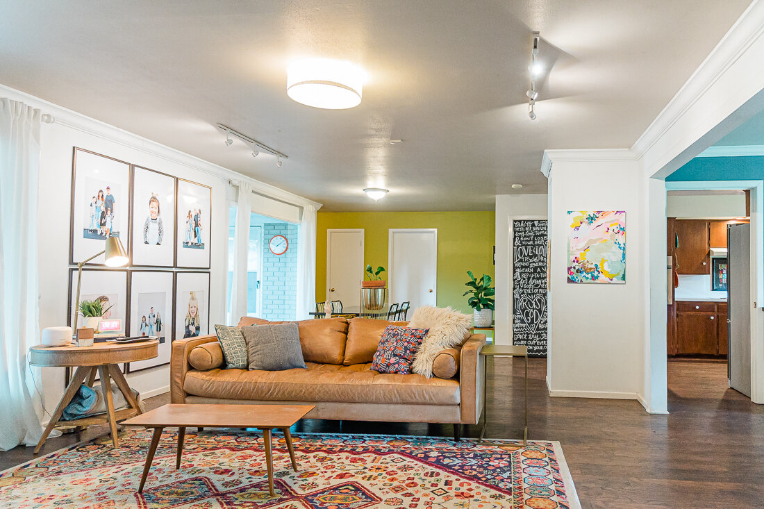
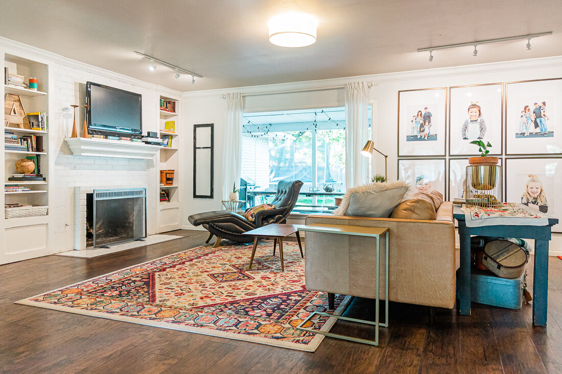
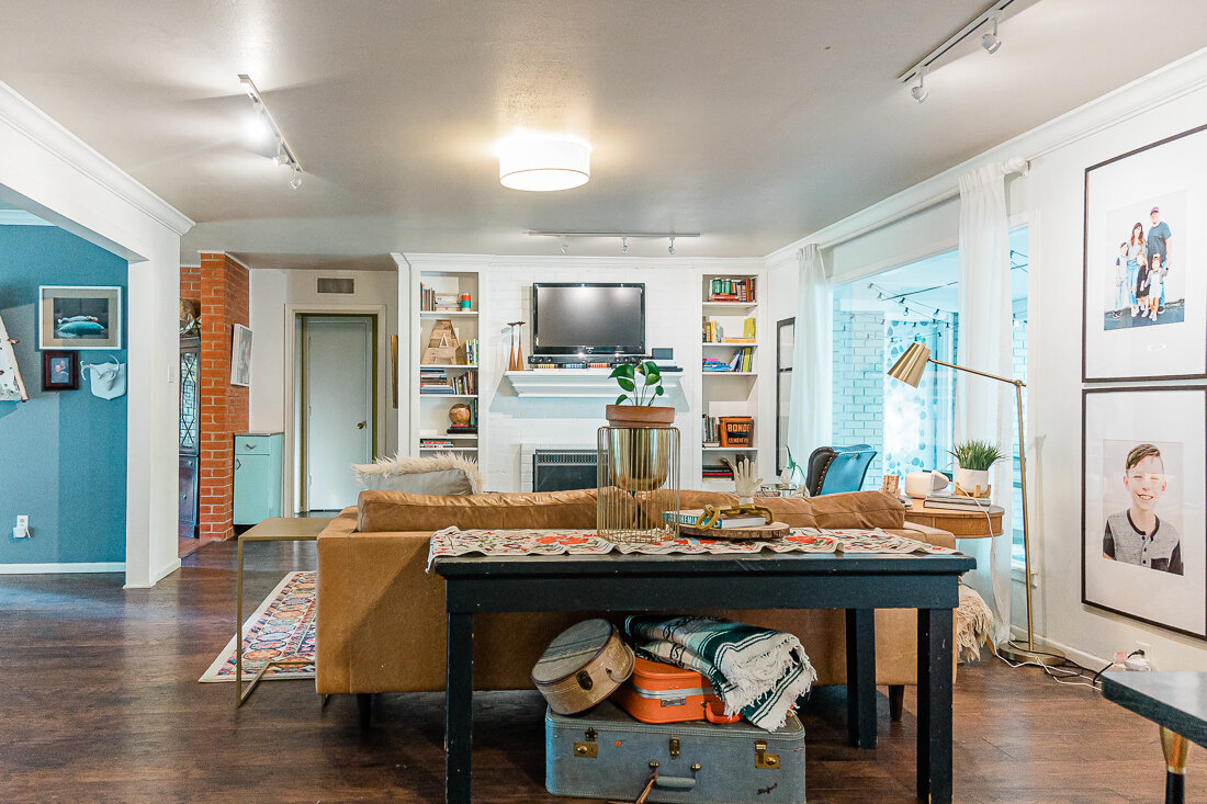
4. We removed quite a few personal family photos, and some weird decor items. I guess I have a thing for body part decor? I took all these items to storage as well. We debated on whether or not to leave our family photo gallery wall, and ended up leaving it, hoping that it would help buyers visualize what they could do with the space. If we’d had more time, I would have tried putting some neutral art in the frames in place of our family photos.

“Manny” the lamp was taken to storage. We love him but understand he’s a lot to take in 😂

“Manny” the lamp was taken to storage. We love him but understand he’s a lot to take in 😂

5. We made sure it smelled good. Before and during showings, we had our diffusers running with our favorite smell. It is such a delicious fragrance, leathery, musky, but fresh. Grab some for yourself here. (It’s not in stock at the time I’m publishing this post, but I watch it often and if you follow me on Insta, I’ll let you know when it’s back! Worth the wait for sure!)

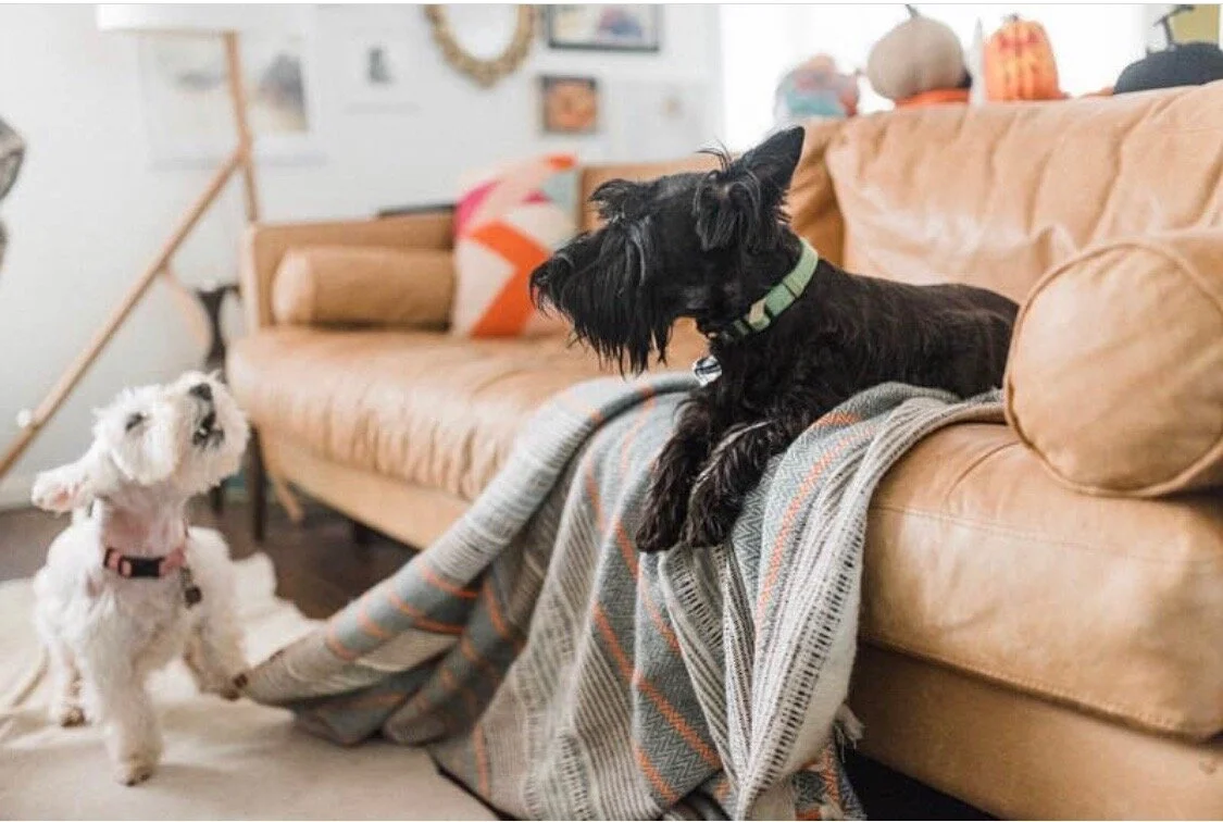
Goodbye pups. We love you but some people just aren’t into animals. :)

Goodbye pups. We love you but some people just aren’t into animals. :)

6. We got rid of any signs of a pet. Dog food, bowls, crate, dog beds and most importantly- the dogs themselves- were gone. Thankfully we were able to bring them to my parent’s house during showings.

7. We did LOTS of touch-up/clean up work. Once everything was clean, we went through and touched up several areas with paint. We also went through the house with a magic eraser- it will clean gunk off of almost any surface! I paid particular attention to anything someone might need to touch, such as doorhandles, light switches, etc.- as these things can really impact the overall impression of the house.

FFDEAE40-19AB-48CD-A9CE-57664DD1E75D.JPG

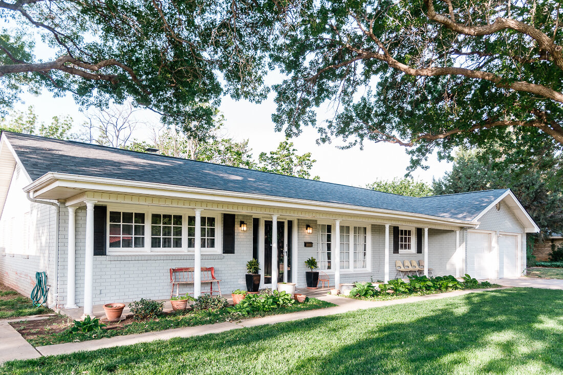
8. We invested in some new front porch decor to make a really great first impression. A new wreath, doormat, and some plants to spruce things up really did the trick. You can check out my wreath and doormat here.

9. We hired someone to help clean. After decluttering and working on getting everything staged, we were exhausted and it was so refreshing to have someone do a deep clean of our home in order to prep for showings. Worth every penny, and we are going to have her back right before we close!

10. We let in the LIGHT. This is a lesson I’ve learned photographing homes for sale. Oftentimes curtains are pulled shut and the natural light a home offers is hidden. We kept all the curtains pulled open, and let in as much light as possible. More light = more space.


We had about a week to get the house ready- since we’d already set a date for an Open House. Towards the end of the process, Shawn and I went around yelling, “We can’t let them know we SIT!” (If you don’t get reference, watch this video). Honestly, I could have spent another week working on it, but I was really proud of our home once it was all ready- even a little sad that we were leaving it!

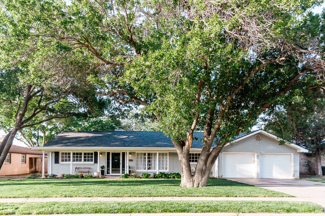
We also made sure we had great photos, and thankfully we had some practice in that area, haha. If you are selling your home, I can’t stress enough the importance of having light and bright photos of your home done by a professional. That combined with a stellar Realtor had our home sold in just 3 days on the market. You can check out the listing photos of our home below. I hope this list has been helpful!


Lissa's Lists • Spring + Summer Home Refresh

HOME + LIFESTYLE, WISHLISTS, Lissa's Listslissa-anglin2 Comments

Since we’re all spending a lot more time at home lately, I have found myself in spring cleaning mode. We’ve purged, rearranged, consolidated…and now I’m excited for a little refresh because the weather had been beautiful lately!

So, for today’s Lissa’s List, I’m sharing a few things I’ve picked up for my home, and a few things I’ve loved having over the years.

Funny Doormat
I saw this a few weeks ago and thought THAT WAS MADE FOR OUR HOUSE. This Etsy shop offers lots of hilarious and cute sayings on custom made doormats.

Under Doormat Rug
I just love this buffalo check and it’s the perfect for under a natural fiber doormat. Comes in red and black for all you Red Raiders, too!

Olive Leaf Door Wreath
I am so impressed with this little faux olive wreath - I’m picky about faux flowers, and this leafy wreath is just perfect for my front door.

Faux Plants


Wall Hanging Faux Plants
I hope to be a real plant lady one day, but these faux hanging plants are just perfect. I think I’m going to grab a few for the kids’ bathroom.


Faux Fiddle Leaf Fig Tree
I have a couple real fiddle leaf fig trees, and let me tell you- they are finicky. Thankfully, you can’t kill this one and it looks quite nice in any corner of your home.

Faux Snake Plant
I’m also snagging some of these for my front porch on either side of my front door. They add the perfect amout of height.

Santal Oil
Ya’ll, if you grab ONE thing off this list, make it this oil! It is absolutely my favorite smell and we keep it in our living room diffuser pretty much all the time.

Outdoor Rug
I get asked about this rug all the time. It is actually an outdoor rug, but I have it under our dining room table because KIDS ARE MESSY. I love that I can literally wipe or spray this off. We’ve had it a few years and it still looks brand new.

Outdoor Pillows
Neutral
Love these neutral pillow covers with the leather accent. I would definitely use these inside, too!
Colorful
These are very similar to what I currently have on our patio, and I love the bright colors and illustrations.

Utensil Caddy
My mom has always kept a caddy like this stocked with paper goods in her pantry, and finally last year I bought one and wondered why I hadn’t done it sooner! This caddy is perfect for stocking with paper plates, napkins, and utensils and makes grilling out and eating on the patio super easy.

Wooden Utensils
I love these and think they are a stylish and Earth-friendly alternative to the plastic utensils. Plus, they aren’t that expensive! I’ve got some in my cart.

Diamond Planter
I’ve been eyeballing this planter on Amazon for a while now! So cute!

Planter with Stand
I have this planter and get asked about it a lot. Neutral and stylish.

Fiddle Leaf Woven Basket
Excited to have gotten one of these as a new home for one of my fiddle leaf figs. I almost bought another one for throw pillows and blankets in the living area.

Paper Goods

While looking for a caddy similar to mine, I came across all these fun paper goods and had to share! What a fun way to make a backyard dinner a little more special!
Amethyst & Rose Gold Paper Plates

Pale Pink & Gold Confetti Paper Cups

White Marble & Gold Cocktail Paper Napkins

Gallery Wall Update

HOME, HOME + LIFESTYLE, CRAFTS, DIYlissa-anglinComment

Lucy has been home for almost 2 YEARS now- and guess which professional photographer has ZERO framed prints of her newest daughter in her home?! Yep. This one. What’s the saying? The cobbler’s children have no shoes? It’s like that at our house, unfortunately.

Realizing the great need for her sweet face to adorn our walls, I was also feeling all cluttered and anxious about the current state of our living room/dining room gallery wall:

IMG_2017 2.JPG

Yes, that is the infamous man lamp. He’s been in the family for years, and he has now relocated to my desk.

Anyway, it was high time for a change. I wanted a simpler gallery wall look and imagined large frames with large white mats. So, my first step was calling up my friend Lauren for some new family photos. Lauren did her MAGIC (seriously, she is magic) in about 10 minutes and the kids were rewarded with giant chocolate bars. I love the photos from this session so much, I’ll have to share them in another post.


If you’d rather watch the video version of this post, feel free to scroll on down!


After measuring the wall and deciding how large I wanted my frames to be, I did a little mock up in Photoshop. I knew I wanted an oversized, floor-to-ceiling look, so I measured the wall and did the maximum size I could.

Wouldn’t that completely cover the wall again?! Yes, but the reason this works from a design standpoint is because the large mats and skinny frames don’t require a lot of visual space.

Tip: If you are wanting to recreate this look, it’s very important that you measure your wall space, and use skinny frames close together (mine were 2 inches apart) with large neutral colored mats.

GalleryWallMockUpweb.jpg

I originally thought I would do black and white, but that was vetoed by everyone else in the family, and also thought I could fit 8 frames in instead of 6…math was never my forte. It did help me plan and visualize, though!

After a LOT of shopping around, I ended up with these frames from Michael’s. They are technically poster frames, which makes them less expensive, and have plastic instead of glass.

When I first hung up the frames, I was a bit disappointed that you could see the slight bending of the plastic when the light glared on them (revealing that they aren’t truly glass)- this is a little thing that my perfectionist self wanted to fix immediately- but after thinking a bit, the plastic is really a better choice for our family right now- especially since these frames sit lower to the ground.

GalleryWall-5225.jpg

You can see the bending glare a bit in the above photos.

I ordered these prints from Sam’s Club, of all places! They were having a sale and though I typically recommend mpix.com, I thought it was cheap enough to give it a shot. In the end, I was pretty happy with the way they turned out. I was able to pick them up in 24 hours. They were delivered rolled up, so I flattened them out and put them under a weighted piece of artboard for a couple of days to make them easier to frame.

My frames are 24x36'“, and I ordered 16x20” prints. I thought I would just order custom mats for the frames, since that is an irregular mat size, but Michael’s was going to charge me $38.00 per frame! So, I was super excited when I found FrameItEasy.com. I was able to order exactly what I needed for around $10 per mat.

Click here to get 10% off your order at FrameitEasy.com!

(affiliate link)

The mats fit perfectly and were great quality. I also love that they do framing, and will probably be ordering all-out framed prints from them next time.

I used regular ‘ol masking tape to tape the prints to the back of the mats. I realize this is a no-no in the photography world, as it’s not archival quality and the chemicals in the tape will cause the prints to break down over time, yada, yada, yada….but let’s be real, I’m going to change these prints again before anything like that starts happening.

Once it was time to hang, I began with the center two prints and worked outward, using a level to make sure the lines were all straight. I’m not going to lie- these frames are a total pain to hang with the tiny sawtooth hanger (I MUCH prefer wire across the back), but you only have to do it once. :)

Tip: Even after I had then all hung, they still tilted a bit one way or the other, so I attached velcro command strips to the backs of the frames and onto the walls, which keeps them straight (and in place when a kid decides to ram into one- we have a rambunctious crew, ya’ll).

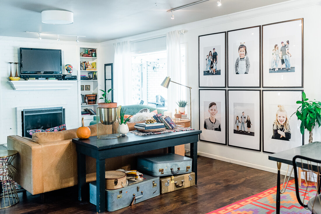
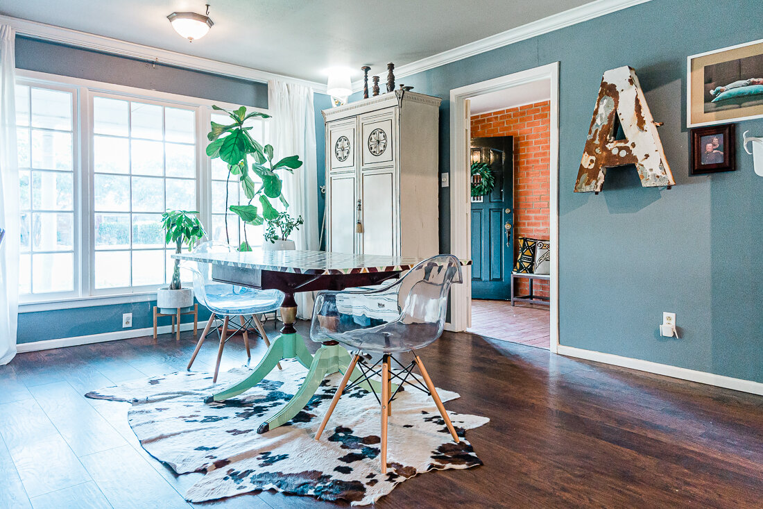
In the end, I was super pleased with how it turned out! The frames are semi-obstructed by the couch in our living room, but all visible from the dining/kitchen area.
GalleryWall-5268.jpg

Watch below for a few more details on the process. I hope this was helpful!

knox's constellation bedroom!
HOME, HOME + LIFESTYLElissa-anglin1 Comment

I’ve been promising Knox (our 8 year old son) that I would redo his room for over a year now and have finally, finally finished it. He has been so patient! This room was previously painted a mint green with a mashup of furniture and an overflow of toys. So, we took the opportunity to do an all-out cleanup and make some bolder design choices that would take him from little boy room and still be appropriate for a teenager.
Knox loves Star Wars and science, as well as maps and travel, so I thought this constellation design I created for a Minted wall mural challenge would work really well for his room. Knowing that it was mostly black/dark, I painted the other 3 walls of his room white. I was really impressed with the quality of the new mid-century style bed we bought from Walmart. I love the upholstered headboard and the tapered legs.

2019-03-17_0001.jpg

LINKS:

RUG // NEON LETTERS // BEDDING // BED // CURTAINS // DESK (Similar, this one is vintage)

I’ve had a red mid-century desk for many years I couldn’t bear to part with, and it worked really well in this room. The wire Knoll Bertoia Chair was a $5 garage sale find (which is crazy- these retail for $832 new- no kidding!). Knox got the projector clock for Christmas. Above his desk are his life verse framed, a letterboard with a gold frame, and a map.

2019-03-17_0005.jpg

LINKS:

FLOOR LAMP (Similar, this one is vintage) // MAP // WIRE CHAIR // CLOCK // LETTERBOARD

A fun new edition is this pushpin map I got custom made from Paperrama. I thought it would be neat for Knox to get to pin the places he’s been in the world, and dream of where he’d like to go! This is a canvas print, but it has a hard backing that allows you to put in the pushpins. They were super quick about the customization and changed the colors to match his room, as well as added 1 Timothy 6:12: “Fight the good fight of the faith. Take hold of the eternal life to which you were called when you made your good confession in the presence of many witnesses.”

2019-03-17_0002.jpg

LINKS:

PUSHPIN MAP // PROJECTOR CLOCK

I like to keep an eclectic feel to our house and don’t like all the furniture to match, so I pulled in a wood side table with hairpin legs I already had and a wire Bertoia diamond chair (another crazy Craigslist find!).

2019-03-17_0003.jpg

LINKS:

WIRE DIAMOND CHAIR (similar, this one is vintage) // SIDE TABLE // GOLD LAMP (Similar)

Once we got the bed in place, I knew I still wanted to put some focal point above his bed. I found these “neon” letters on Amazon (link below) and Knox thought they were super cool. They are really LED lights and are lightweight so they are easily hung. They do have wires that extend from them for the battery or USB plugin, but I found a USB connector that allowed me to connect all 5 letters to a hub so we can plug them into an outlet and not use up a ton of batteries.

We chose the word BRAVE because this is Knox’s focus word. This post explains what a prayer word is and why it is so special to us and him!

2019-03-17_0004.jpg

LINKS:

NEON LETTERS // USB HUB (GET THIS if you are getting the neon letters!)

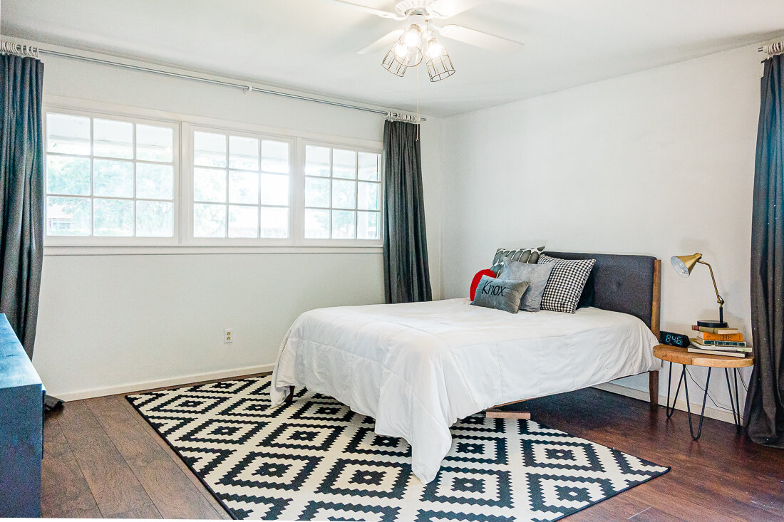
The ceiling fan was a much-needed and simple update, and I still think I might take the whole thing down at some point and paint it all black, but it was nice to get rid of the frilly lamp cages, and replace them with these industrial ones I found. A quick $20 fix!

2019-03-22_0001.jpg

LINKS:

INDUSTRIAL LAMP CAGES

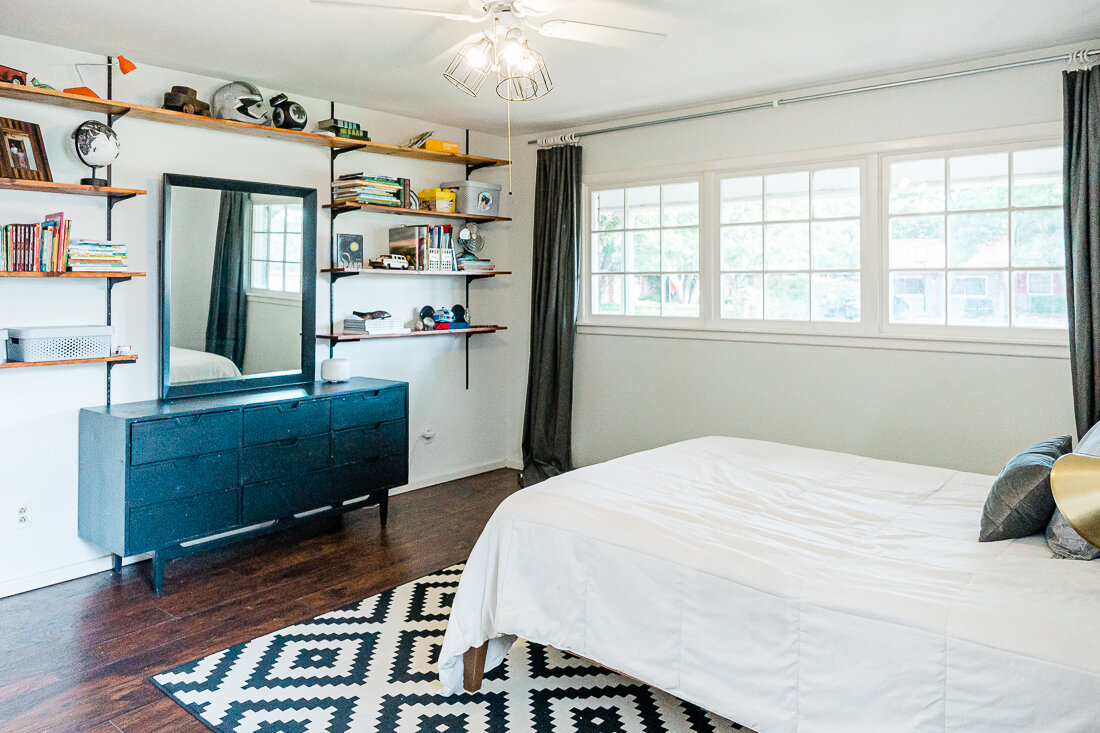
Knox’s old bed had storage in the bottom, so I knew when we got rid of it, we would need another storage solution. My mom (who is a pro estate-saler) found this mid-century dresser for him quite a while ago, and so I dreamed up some shelving to go around it. Thankfully, Shawn was up for the job!

It was a fairly easy D.I.Y.- we followed the outline of this tutorial. I did have to search all over town to find bracketing that was already painted black, and I’m so glad I did! After checking Lowes and Home Depot, it was True Value that had it. It was 1/2 the price of the white and grey versions I had seen AND I didn’t have to spray paint it. We bought the wood at Lowe’s and stained it, and then just put it together. I think the whole shelf project was around $200.

Another big project was getting all of Knox’s toys organized and contained into the storage boxes you see on the shelves. I basically sat everything out on his bed and said, “everything needs to fit in these 4 boxes, and if it doesn’t, it’s being donated”- which actually worked! We did use an old cube bookshelf you can see on the floor next to the dresser for some stuffed animals/robots, but everything else is contained on the shelving!

2019-03-17_0007.jpg

LINKS:

BLACK BRACKETS // BLACK SHELF TRACK // GREY STORAGE BOXES- LARGE // CUBE BOOKSHELF // DRESSER (Similar, this one is vintage) // BLACK AND WHITE GLOBE // INDUSTRIAL FAN (Similar, this one is vintage)

One solution I was particularly proud of was the use of these magazine files for softcover books. Since the books couldn’t stand up on their own, and I didn’t want to stack them on top of each other, this was a great solution. I found these cute gold ones and thought they were perfect!

2019-03-17_0010.jpg

LINKS:

GOLD MAGAZINE FILES // POTTED FAUX PLANTER (I found this one at HomeGoods)

2019-03-17_0006.jpg

LINKS:

AGATE BOOKENDS // DIFFUSER // GLOBE (Similar, this one is vintage) // DARTH VADER HELMET // STORAGE BOXES

I love the way his room looks as it gets darker outside. The letters glow and the constellations seem to as well. I typically like light-and-bright but this dark-ish room makes me just as happy, and I really feel like Knox will be able to use this room for many years.

2019-03-17_0009.jpg

Let’s talk about the wall mural!

I created the wall mural using engineering prints, which you can get at local print shops like FedEx Office, Staples or Office Depot. This is the 3rd or 4th time I have used this technique, and so I decided to film the process and make it a Skillshare class! So, if you have a Skillshare account, you can go watch and learn- or use this link to get 2 months for free- which is more than enough time to watch the whole class.

You can easily check out all of the products I’ve linked here:

PIN IT!

blackwhiteboysroominsop.png

DIY Scribble Floral Mural

HOME + LIFESTYLE, MOMLIFE, DIY, CRAFTSlissa-anglinComment

This is an idea I've had brewing in my head for well over a year now. It all started when my sister put in this gorgeous wallpaper in her daughter's nursery. THEN I started crushing on this Hygge & West wallpaper and just KNEW I had to put it in the girls' room (I'm actually really excited about the wallpaper resurgence- so many modern and colorful designs!).  

However, after doing all the calculations, I decided that it simply wasn’t in the budget. And, after seeing the oversized florals in Hayden's nursery I thought that might be a little more do-able. I also figured I could paint over it if I hated it! 

So, I decided to give the floral thing a shot. This method I used is really so forgiving- I will describe it in detail as best I can! And it was actually a quick project – the planning took a lot longer than the actual painting.

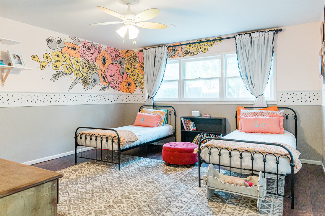
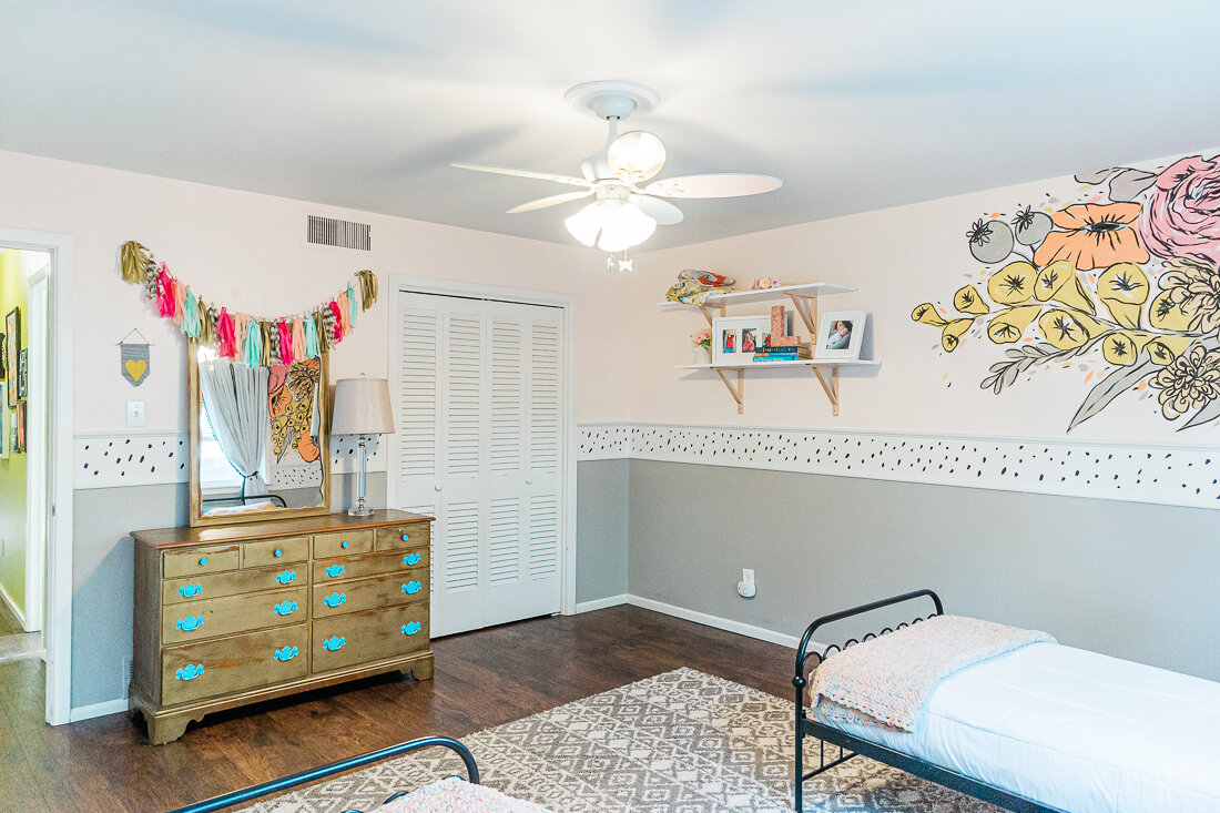
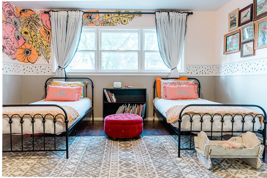
The first thing I did was sketch the composition on my iPad so I knew so I could get my ideas out "on paper", and play with color palettes. I pulled the composition off of a few bouquet photos I liked and traced certain parts of it to get me started. After that it was a matter of filling in the gaps, and repeating some of those same florals in different spots. I knew wanted to keep in the color scheme I have been prepping for their room anyway- pink, orange, mustard yellow, and black and white. I wanted the flowers to have more of an illustrative feel as opposed to a realistic look, which I knew would be a lot easier for me to achieve. I like to call these my "scribble flowers". 

Thanks to my iPad and Procreate, it's actually really easy to share that process with you here:

The room also has a chair rail on all the walls (when we moved in there was a really uh, interesting frog border sandwiched in-between the molding)-  and I wanted to make sure that everything would look right with the chair rail– so I knew I needed to do something to add interest there to keep the flow throughout the room. So, I also drew up a mock up of how it would look in the room. 

My room mock up with the floral design and border.

My room mock up with the floral design and border.

This woman actually swore she would never paint a room pink...famous last words!

This woman actually swore she would never paint a room pink...famous last words!


Once I had come up with a design I was happy with, it was time to paint!

My mom came over and helped me paint the three different colors on the walls – and this is definitely the hardest part! We ended up having to paint the ceiling after we realized it wasn’t actually white, but a very light blue which wouldn’t complement the new colors. I'm so thankful I had my mom to help me pick out the grey color (really more of a greige than grey) on the bottom- previously it was a really blue grey which made it feel cold and sterile to me. Since I knew we'd be adding warmer colors, it was really important to pick a grey with a warm undertone- otherwise it would have made the original grey look very blue.

IMG_8881.PNG

Pink background color: Valspar Arctic Ice 

White: Valspar Downy

Grey on bottom and in mural: Valspar Requisite Grey

We used Satin sheen with every paint- I have found it is very scrubbable without being too shiny.

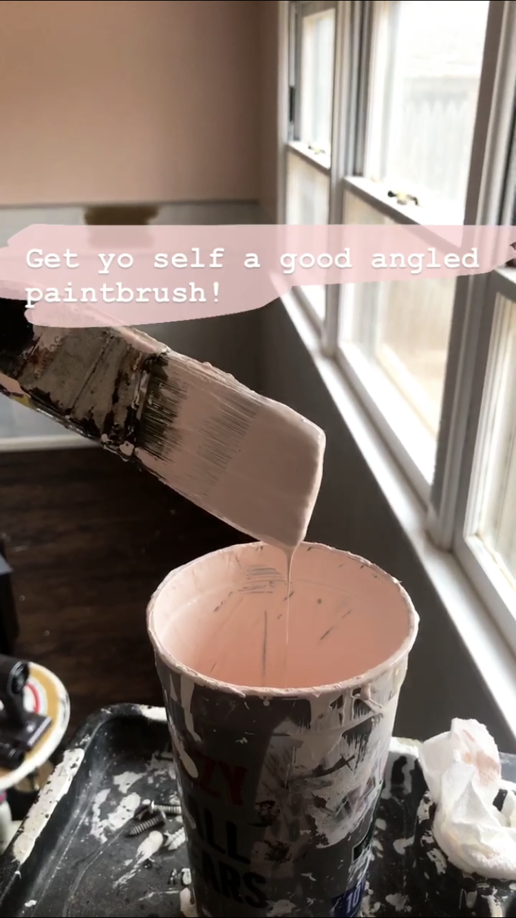
If you watch my Insta stories (follow me @lissaanglin), you’ll remember that I recommended using an angled brush as opposed to a square one. I hate messing with painter's tape and have found that an angled brush gives me as good or better results. The key with the angled brushes to not overloaded with too much paint and go slow.

Once my base coats were ready, it was time to sketch out the composition. I’d like to do my outlines with chalk, since it wipes off easily. At first I tried drawing with white chalk, but it just wasn’t enough of a contrast on the pink, so I ended up using a light purple chalk. It did end up mixing with the paint somewhat, but it just wasn’t that big of a deal for me – so be warned if you choose to use a darker color of chalk – you might see it a bit!

Next I mixed all of my additional colors for the mural. To keep everything really consistent, I chose to use the same white paint that was on our trim and chair rail, so that all of the paint would have the same base color. Not all white paints are created equal – some have a blue base, some have a green base, some red, some yellow – you get the idea. I mixed the paint in my fancy Solo cups- adding about half a cup of white paint and then tinting the white with these paints from Michaels by adding just a bit at of color at a time and stirring well.

I am a messy painter!

I am a messy painter!

Keep in mind that your paint will dry darker than it looks when wet. It might be a good idea to paint yourself a test on a piece of paper and let it dry so that you can see the actual colors. I would also suggest using a more limited color palette – three or four colors max – it will keep it much more consistent and professional looking.

Once I had the composition sketched out and paints ready, it was time for the paint bottom layer which I'm calling the "blobs". This is a really fun part of the process. Using a square brush like these, I began to apply my blobs of paint using my outlines guides- but I wasn't too precious about it. ;)

 I wanted to make the color bleed outside of the outline in the end, so I purposely made the color blobs a bit larger than they needed to be. For simplicity sake, I decided to make all of the same types of flowers the same color – so peonies were pink, chrysanthemums were orange, etc. I attempted to do a time-lapse video of myself painting, but didn't quite make it to the outlining stage before my iPad died. However, hopefully this video will give a good idea of how I painted my blobs:


Once the blobs were finished, I let the paint dry fully and then it was time for the outline! I recommend using a round brush (these are great) for the outlines. Keep in mind you will likely need a smaller brush than you think, because when you put pressure on the brush, it’s going to get bigger. So, it’s better to lean on the smaller side so that your outlines don’t become too big.

Can't wait till there are two sweet girls playing in this room!

Can't wait till there are two sweet girls playing in this room!

Looking at my original sketch, I began to paint the outlines over my colored paint blobs. I didn’t worry too much about staying inside or outside of the lines – and purposely went outside the lines frequently. I used only 1 round brush for all of the outline, so that it was consistent throughout.

Once I was finished, I added some random colored dots/blobs of all the colors I used around the entire piece.

That’s it! I needed up having quite a bit of extra paint that I had mixed, and I didn’t want to throw it out because I’m a paint hoarder, so I went to the dollar store and bought some cheap plastic containers that worked perfectly for storage. Now if anything ever happens to the flowers (likely in our household), I have handy touch up paint.

After I was done I was hesitant to hang the curtains on top of the flowers, but that had been my intention from the beginning, and I love the way the flowers peek out from behind. Also, this room has a ways to go but let's be real- the toys are usua…

After I was done I was hesitant to hang the curtains on top of the flowers, but that had been my intention from the beginning, and I love the way the flowers peek out from behind. Also, this room has a ways to go but let's be real- the toys are usually on the floor anyway. :)

There you have it! If you made it through this far, thanks for reading and I hope you attempt some scribble florals yourself!

Always a project...Knox's Room Update

HOME + LIFESTYLElissa-anglinComment

I just can't ever sit still with house projects. Once I complete one, I have the urge to start something new, and much to Shawn's chagrin, that usually involves paint. :)

This project, however, my husband has actually volunteered himself for- so in order to keep my worker happy, I am doing the most planning ahead that I can.

What's the project, you ask?

Oh, just the one where we switch out the kids' bedrooms in the middle of our busiest work season.

Our house has 3 bedrooms, two of which are the EXACT same size, and located on the same side of the house- one nearer the front of the house, and one near the back. When we moved into this house, we only had 1 kiddo (Knox) and so we put him in the bedroom that was toward the back of the house, which worked perfectly- until we had another baby. 

Liv's nursery/room has inhabited the front bedroom, and there have been many times I wished I had switched their rooms. Namely, those times the doorbell rang and woke up the sleeping baby I had in the room right next to the front door. 

So, realizing that we will be welcoming another sweet girl sometime in the near future who will share a room with Liv has made me want to go ahead and do the switcheroo. So maybe you could call this nesting, in a way?

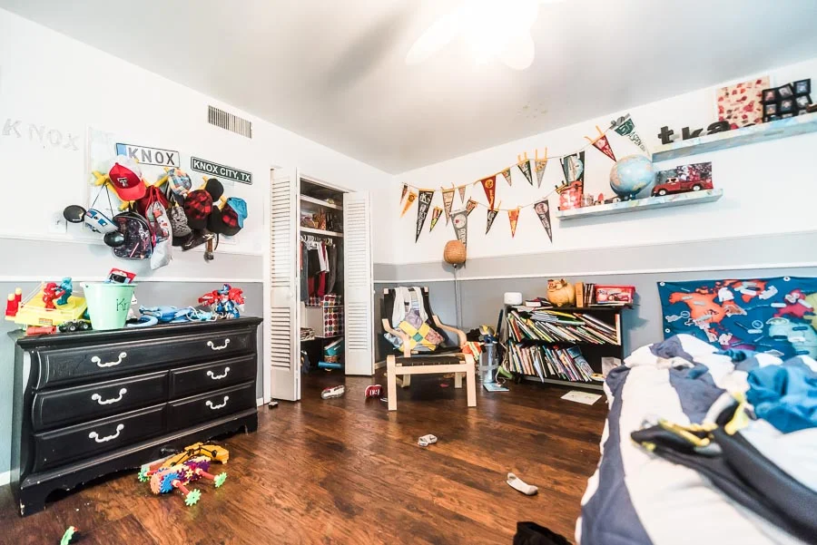
Regardless- it's time for Knox to get a little update. Here's a current view of his room:

KnoxRoom-7488.jpg


Yeah, that's right- this is the way it USUALLY LOOKS. No prettying up real life for the internets here. 

I've made peace with the random socks and shoes on the floor, and we just aren't the people who make their beds every morning. But the books on the ground, the toys piled up on every piece of furniture, the sheer amount of toys that aren't actually played with anymore...those are the things that drive me bonkers. 


Here's what's working/what I'd like to keep for this room:

  • The full size bed
  • The vintage pennants and signs
  • The little mid-century bookshelf (I salvaged out of the alley many years ago)
  • The Ikea Poang chair and ottoman
  • The dog tail hooks that are holding up the art (not pictured)
  • The square storage shelves (functional, though I may want to update the fabric boxes)
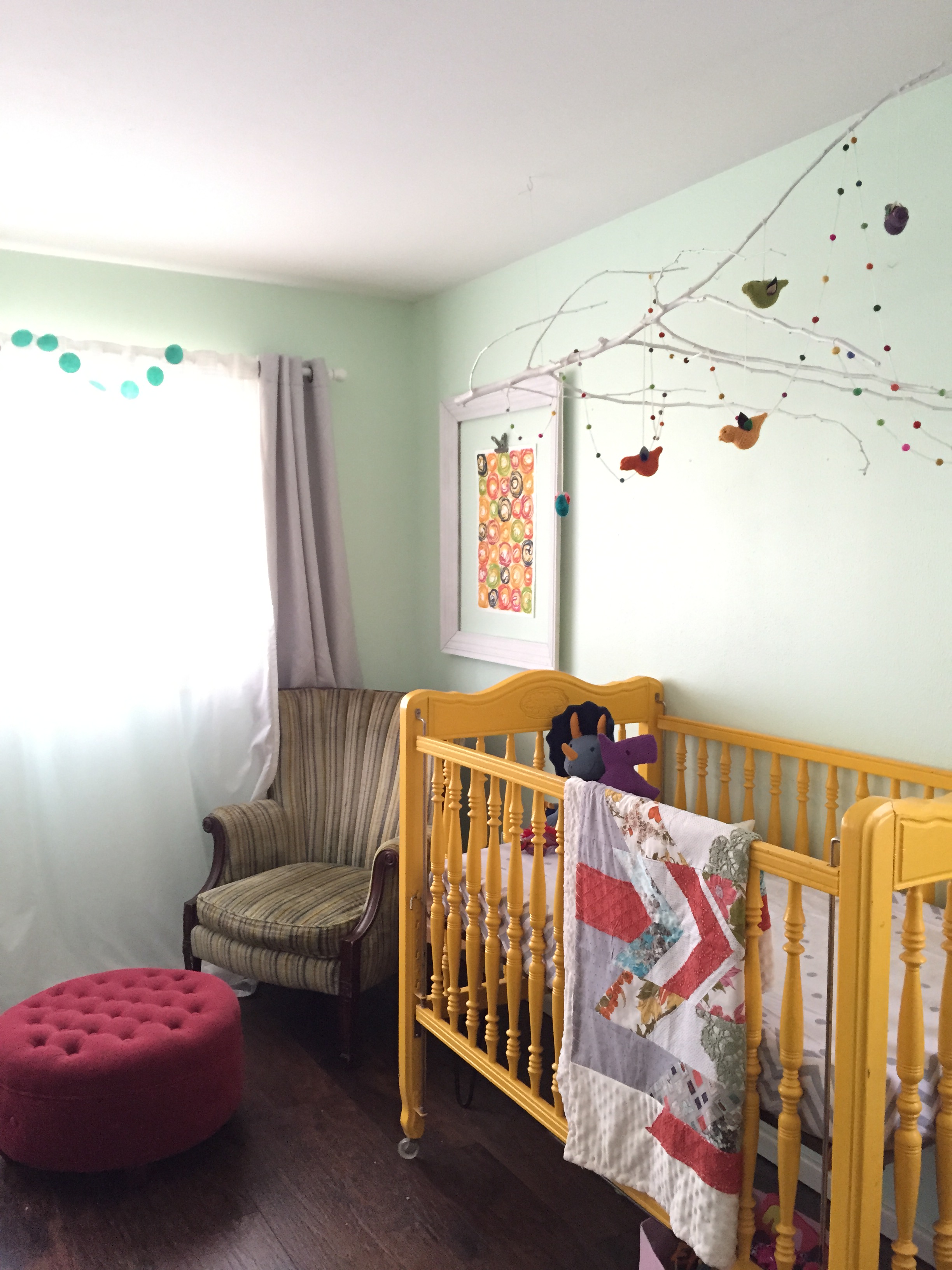
Current mint wall color.

Current mint wall color.

Here's what I want to see gone/improved:

  • Hanging chair
  • Dresser (possibly)
  • Train table
  • Floating Shelves
  • Toys no longer played with (which is going to be a job in itself)

Another thing I am considering is that he will need to be able to "grow with" this room. He is just 6 right now, but I'm wanting to make it more of a "big boy" room he can really utilize in the coming years.

So, I'm wanting to add:

  • Desk
  • Upright storage or mirror over dresser
  • Nightstand

Liv's room (a.k.a. Knox's future room) is currently painted a happy, light mint color- and to save myself some time, I am hoping to keep that color, while adding an accent wall. 


Check out the mood board I put together:

I'm hoping to reuse several items we already have, plus add some must-haves for a "big boy" room, like a desk, reading light, and extra storage in an armoire. 

One of the things I am most excited about is creating an engineering print mural on one of the walls. This will be my third experience doing a mural like this- my first was in our retail store, Culture Clothing- look how tiny Knox was when I was putting it up! 

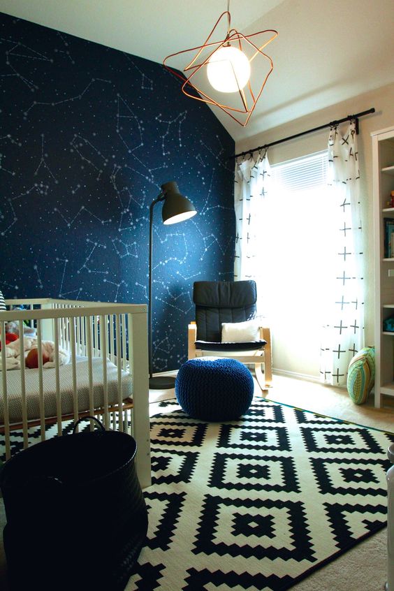
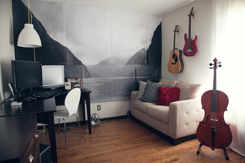
I'm having trouble deciding on whether I want to do an A) Constellation pattern or B) Mountain scene. Knox says he doesn't care and that he likes both. So, what do you guys think? Here are a couple of photos for inspo:

Source

Source

Source

Source

No matter what, it will be black and white print, though I do love the blue of the constellation wall- it's just much less expensive to do the black and white!

I'm also debating about curtains- hoping to keep them some sort of black and white pattern, but- how important is it that I get blackout curtains now that he is 6? Also, we will be raising those curtains allllll the way to the ceiling this time.

I also have not even thought about bedding yet- eesh! He does have a white down comforter inside the duvet he is currently using- so we will probably just stick with that. Simple. And BLEACHABLE. 

Any other input/thoughts/ideas/wish-you-hads for me? 

a friendly fiddle leaf!

HOMElissa-anglinComment

So, yeah. I'm about to be that lady who devotes an entire blog post to a tree. But I'm TOO IN LOVE. I can't help myself. 

Last week, my husband who loves me tracked down a fiddle leaf fig. This is a big deal because I have been looking for one and though commonly found at a home improvement store, for some reason, Lubbock just doesn't carry them. So when he told me he found one for me, I was alllllll over it. 

I've been crushing on these trees for a couple of years now (see them all over The Jungalow, Apartment Therapy, and The Selby). They're indoor plants that somehow add interest to every corner they inhabit. 

So Peter from Xylm (follow him on @xylmshop on Insta) brought over the perfect little plant. Peter is working on opening a shop next to Culture Clothing (our resale shop) in the Tech Terrace area. He is the guy that cares for all our plants at the shop and has a knack for cacti, air plants, and trees just like this one. I can't wait to see what he does with his new store!

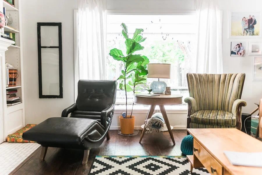
I was nervous about where to place it since our home has covered porches on both the north and south sides- but Peter said that was actually perfect as direct sunlight could be too much for it. Look how perfectly it fits! 

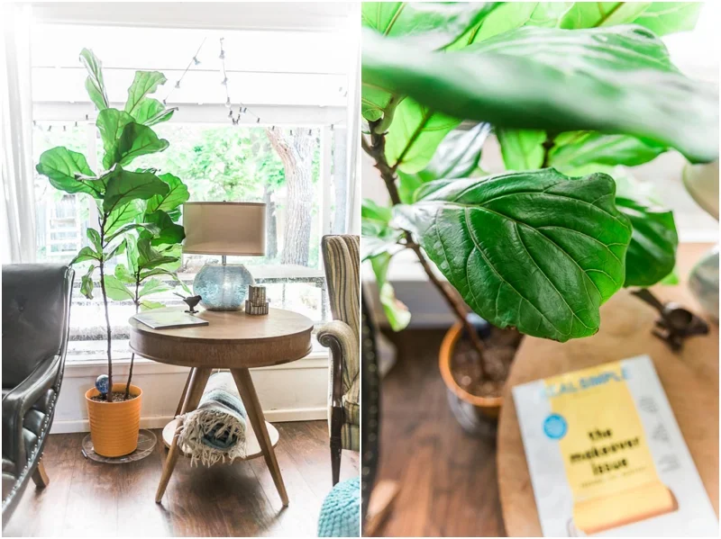
I just love that pop of green! Peter actually replanted it in that yellow-orange pot before bringing it, not having seen our home before and it fit so well.

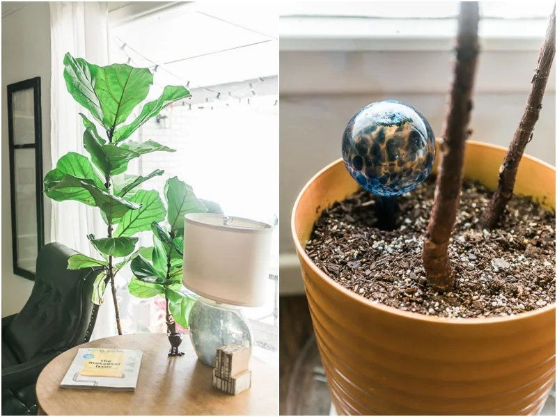
I ran out to buy an Aqua Globe almost immediately- knowing that I did NOT want to leave it unwatered or overwatered. If you've never used an Aqua Globe before, I love them! They are blown glass bulbs that basically self-water your plant. When they are empty, just refill! I found this one at Lowe's, but I've also ordered them on Amazon. There are two sizes and they come in a few pretty colors. 

I was worried that the kids would be tempted to touch the tree (we don't have anything too precious in our home), but so far neither have and both have noticed/liked it. I have been amazed at how much a small thing like a tree would bring me a bit of happiness on a daily basis. 

Anyone else have one of these? Any tips?